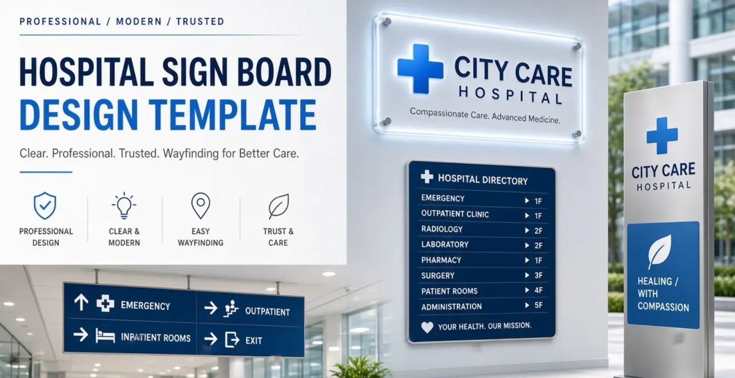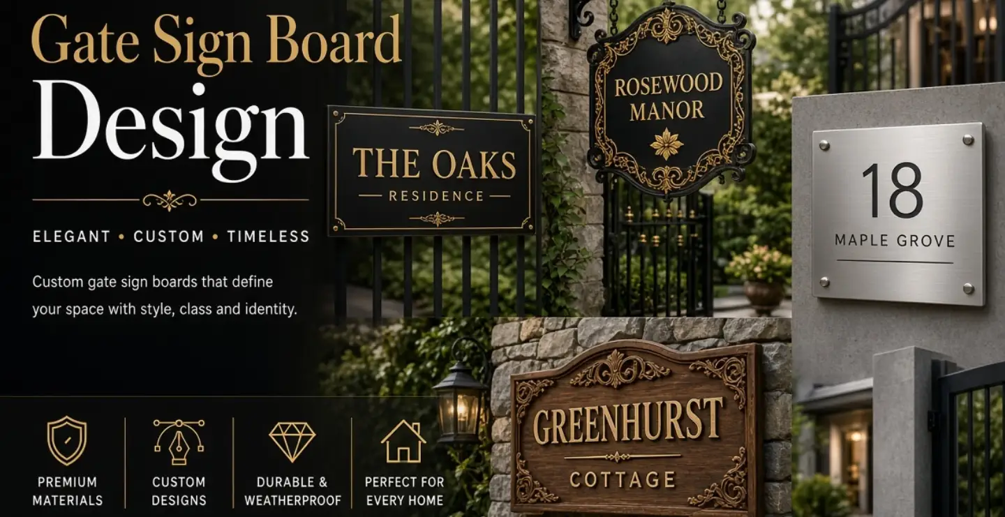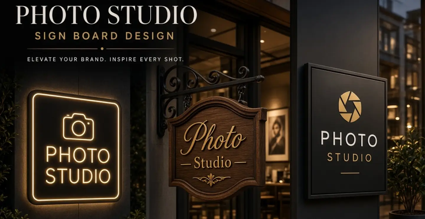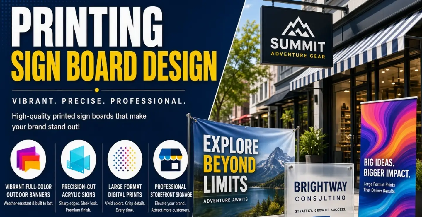
If you run a printing business, your sign board has a unique challenge: it must prove your skill. A print shop that offers visiting cards, banners, flex boards, stickers and packaging cannot afford a dull or messy sign. A smart printing sign board design shows customers that you understand colour, layout and finishing, and that their jobs will look good when you print them.
This guide helps print shop owners create a sign board that attracts walk-in clients, explains services quickly and strengthens the brand.
Why a Printing Shop Needs a Strong Sign
Printing is a competitive business, and in most areas customers can find several shops within a short distance. Many decide on convenience and first impression. A sign that is clear, colourful and professional makes people feel confident that your work will be accurate and polished. It also helps new customers understand quickly what you offer, whether that is digital printing, offset printing, flex banners, ID cards, wedding invitations or custom gifts.
Show What You Do in Seconds
Many people do not know the technical terms for printing services. Instead of listing machines or processes, use words customers search for: visiting cards, flex printing, banners, stickers, brochures, T-shirt printing, mug printing, wedding cards and photo frames. Pick the three to five most important services and display them in a neat block. If you offer many more, use a secondary board, a window graphic or a menu-style panel inside the shop.
Using Colour as a Brand Statement
Printing and colour go together. Many print shops use the CMYK-inspired palette of cyan, magenta, yellow and black as a design theme because it instantly communicates printing. You can use these colours as small accents, such as a row of colour bars, dots or blocks, while keeping the main name bold and easy to read. If you prefer a more modern identity, pick two strong brand colours and use them consistently across the sign, bills, packaging and social media.
Keep the design balanced. A sign with too many bright colours can look messy and unprofessional, which is the opposite of what a print shop wants to show.
Typography for Printing Businesses
Choose a clean, bold font for the shop name. Sans-serif fonts work well for quick readability. Use a second, simpler font for the services list. Avoid mixing too many styles. Because customers will judge your attention to detail, make sure spacing, alignment and spelling are perfect. A misspelt word on a printing sign is a real credibility problem.
Types of Sign Boards for Print Shops


Flex Boards
Flex is economical, quick to produce and allows full-colour graphics. It is a common option for new shops, though it needs a good frame and regular replacement as it fades.
ACP and Aluminium Composite Boards
More durable than flex, with a flat, clean finish. Printed vinyl or cut letters can be applied for a sharp, professional look.
LED Backlit Signs
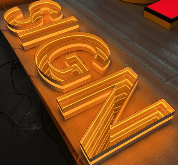
Great for shops that attract evening traffic. Backlighting makes colours glow and keeps the shop visible at night.
3D Letters
Acrylic or metal raised letters give a premium appearance. A combination of 3D name letters with a printed services panel works well.
Vinyl Window Graphics
Window stickers can list services, offers and contact details while still letting customers see inside. Print shops can also showcase their own quality by using high-resolution graphics.
Using Samples as Part of the Design
A printer's best advertisement is the work itself. Consider a display window or frame showing samples of visiting cards, brochures, stickers and banners. Keep the display neat, change it regularly and highlight your best work. Outdoors, one or two high-quality sample images can be printed on the sign, but avoid clutter. The main board should stay readable from a distance, while the window and counter display handle details.
Layout Tips
- Place the shop name and logo at the top as the main focus.
- Add a one-line description such as digital printing and flex banners.
- List the key services in two or three short columns.
- Put the phone number or WhatsApp number in a clear, bold style.
- Leave empty space around elements so the board looks organised.
- Align text and icons carefully, since misalignment is very noticeable on a printing sign.
Adding Icons and Graphics
Simple icons can communicate faster than words. Use small symbols for visiting cards, banners, mugs, T-shirts, stickers or photo prints. Keep them consistent in style, size and line weight. Avoid low-resolution pictures, stretched logos or copyrighted images. Your sign should demonstrate good print quality, so even tiny details must be sharp.
Day and Night Visibility
Many customers visit print shops in the evening after work. Good lighting extends your business hours visually. Use LED backlighting or well-placed spotlights, and check that colours remain attractive under light. Dark backgrounds with bright lettering generally perform well at night, while light backgrounds with dark text perform well in daylight. Test both before finalising.
Placement and Size
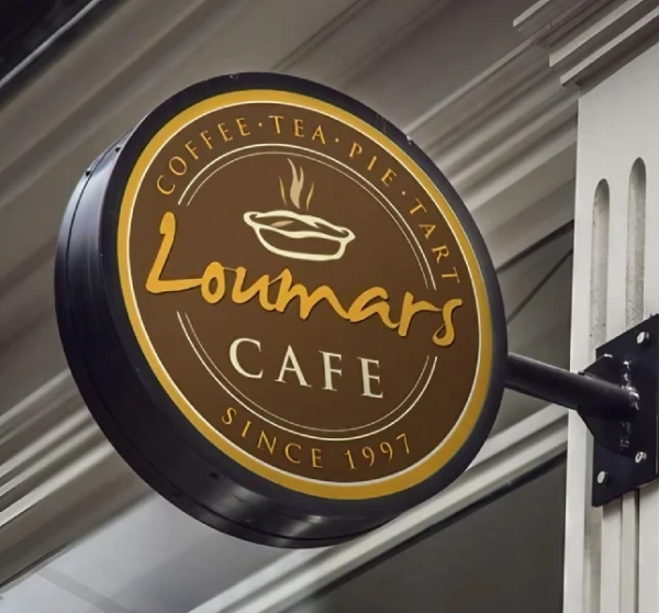
Place the main board above the entrance and ensure it is not hidden by trees, wires or neighbouring boards. In narrow lanes or busy markets, consider an additional projecting sign so people walking from either side can spot you. Choose letter sizes based on how far away customers will first see the shop.
Mistakes Print Shops Should Avoid
- Listing too many services in tiny text.
- Using blurry or stretched images on the sign itself.
- Mixing too many fonts and colours.
- Ignoring spelling and alignment checks.
- Leaving a faded or torn board in place for too long.
Print Shop Signs for Different Specialities
Printing businesses vary widely, and the sign should reflect your focus. A digital press serving offices might highlight documents, brochures and visiting cards. A flex and banner printer should show outdoor advertising, hoardings and vinyl work. A gift and personalisation shop can feature mugs, T-shirts, photo frames and custom gifts with playful graphics. A wedding card printer may prefer a more elegant, decorative style. Tailoring the sign to your main customers helps the right people notice you faster and understand that you are the right place for their job.
Frequently Asked Questions
Which board is best for a new printing shop?
A printed flex or ACP board is a cost-effective starting point. As the business grows, you can upgrade to LED backlit or 3D letter signs.
Should I list prices on the sign board?
Usually no. Prices change and long lists clutter the board. Mention an offer or starting price on a separate display, and keep the main sign focused on your name and services.
How can a printing sign stand out in a crowded market?
Use a clear name, strong contrast, tidy alignment and a distinctive colour accent. A neat sample display near the entrance also draws customers in.
Final Thoughts
A printing sign board design should be a confident preview of your craftsmanship. Clear services, balanced colours, sharp graphics and careful alignment tell customers that you take quality seriously. With a smart sign, your shop becomes easier to find, easier to trust and easier to remember.
Brand Signages can help you create a printing shop sign board in the right size, material and lighting to match your brand and budget.