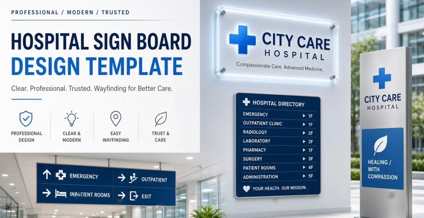
In a hospital, a confusing sign is more than an inconvenience. Patients are often anxious, in pain or in a hurry, and families may be visiting an unfamiliar building under stress. Clear signage helps them reach the right department quickly and calmly. A well-planned hospital sign board design template gives hospitals, clinics, nursing homes and diagnostic centres a consistent system that reduces confusion and supports staff.
This guide explains how to build a practical signage template, including the types of signs, layout rules, colours, fonts and materials to consider.
Why Hospital Signage Needs Special Care
Hospitals are complex. They contain emergency rooms, outpatient departments, wards, pharmacies, laboratories, operation theatres, billing counters and many other areas, all used by people with very different needs. Good signage supports patient experience, speeds up movement, reduces pressure on reception staff and helps in emergencies. It also builds confidence, because an organised sign system suggests an organised hospital.
Core Principles of a Good Hospital Sign Template
Clarity Above Everything
Use simple words and avoid technical jargon wherever possible. People look for words like emergency, pharmacy, X-ray, billing, lift and washroom. If medical terms are necessary, add a plain-language description.
Consistency
Use the same fonts, colours, icon styles and layouts throughout the building. Once a visitor understands your system on the ground floor, they should be able to follow it on every other floor.
Accessibility
Signs should be readable by older adults, people with low vision and those who are unfamiliar with the language. Large letters, strong contrast and universal symbols are important. Where relevant, include Braille or tactile elements for key signs, and mark accessible routes clearly.
Calm and Professional Appearance
Colours and design should feel clean and reassuring, not loud or cluttered.
Types of Signs in a Hospital Template
- Identification signs: Mark specific rooms and departments, such as reception, pharmacy, laboratory or doctor cabins.
- Directional signs: Use arrows and short labels to guide people along corridors, to lifts and between buildings.
- Information signs: Show timings, visiting hours, rules and notices.
- Regulatory and safety signs: Provide instructions such as silence, no smoking, keep clear and mask required where relevant.
- Emergency signs: Show exits, fire extinguishers, assembly points and emergency routes.
- Building and exterior signs: Include the main hospital name board, entrance signs, ambulance entry and parking guidance.
- Wayfinding maps: Floor plans placed at entrances and lift lobbies, with a clear marker saying you are here.
Colour Choices for Healthcare Signage
Blue and green are commonly used because they feel calm, clean and trustworthy. White and light grey backgrounds support a hygienic look. Use red sparingly, mainly for emergency and fire safety. Some hospitals use colour coding for floors or departments, for example a different colour band for each wing, which helps visitors remember where they are going. Always maintain strong contrast between text and background. White text on dark blue or dark text on a white panel are dependable choices.
Typography and Symbols
Pick a clean sans-serif font with open letter shapes. Avoid decorative styles. Keep text size generous, and use title case or sentence case for easier reading rather than all capitals for long labels. Use standard icons for common services, such as a cross for medical services, a wheelchair for accessible routes, a stretcher for emergency, and arrows for direction. Combining words with icons helps people who struggle with reading or do not know the local language.
If your hospital serves a multilingual community, include the regional language along with English. Keep the sizes balanced and check the spelling carefully with a native speaker.
Sample Layout Template
A simple and effective layout for a directional sign follows this order: the icon on the left, the department name in large bold text in the centre, and the arrow on the right. For identification signs placed beside doors, show the room name or number at the top, the department or doctor's name below it, and a small timing line at the bottom if needed. For entrance boards, put the hospital logo and name at the top, followed by a short line such as 24-hour emergency, multi-speciality hospital or diagnostic centre.
Limit each sign to a few lines of text. If a corridor has many destinations, group them by floor or zone rather than listing everything in one place.
Materials and Finish
Hospital signs must be durable and easy to clean. Acrylic, aluminium, stainless steel and laminated panels are common choices. Smooth, non-porous surfaces are easier to wipe and keep hygienic. Matte finishes reduce glare under bright lights. For outdoor boards, use weather-resistant materials and LED illumination so the hospital is visible at night. Emergency exit signs and some safety signs may need photoluminescent or illuminated formats, depending on local regulations.
Placement Guidelines
Place signs at decision points: entrances, reception areas, corridor intersections, lift lobbies, staircases and doorways. Keep a consistent mounting height so visitors know where to look. Hanging signs work well in long corridors, while flat wall signs suit doors and rooms. Make sure no sign is hidden behind furniture, equipment or open doors. In emergency routes, keep signs unobstructed at all times.
Regulations and Standards
Hospitals must follow fire safety, accessibility and local authority rules for signage. Requirements vary by location, so consult the relevant local guidelines and the hospital's safety officer before finalising the template. This helps ensure your signage is both helpful and compliant.
Common Mistakes to Avoid
- Using too many signs in one area, creating visual noise.
- Inconsistent fonts, colours and icon styles across floors.
- Tiny text that cannot be read by older patients.
- Outdated signs after departments move or are renamed.
- Poor placement where signs are blocked or placed too high.
Signage for Clinics and Small Hospitals
Smaller facilities do not need the same scale of signage as large hospitals, but the principles remain the same. A clinic should have a clear outdoor board with its name, speciality and timings. Inside, the reception, waiting area, consultation rooms, billing counter and washrooms should be easy to identify. A simple floor plan near the entrance helps first-time patients. Use the same colours and fonts on boards, prescriptions, forms and websites so patients feel the clinic is organised and professional. Even a small set of well-designed signs improves patient comfort and reduces repeated questions at the front desk.
Frequently Asked Questions
What colours are best for hospital signs?
Blue, green and white are widely used for their calm and clean feel. Red is best saved for emergency and fire safety messages.
Should hospital signs be bilingual?
If your patients speak different languages, yes. Adding the local language alongside English helps more people find their way, as long as the text is accurate and clearly arranged.
How often should hospital signs be updated?
Update them whenever a department moves, is renamed or changes timings. Outdated signs cause confusion and extra work for staff.
Final Thoughts
A strong hospital sign board design template creates a calm, easy-to-navigate environment. When signs are clear, consistent and accessible, patients feel more confident, staff spend less time giving directions and emergencies are handled more smoothly. Good signage is a quiet but important part of good care.
Brand Signages can help hospitals and clinics plan complete signage systems, from entrance boards to department and directional signs.