A photographer sells more than pictures. A photo studio sells taste, creativity and trust. Before a client sees your portfolio, they see your front board. A thoughtful photo studio sign board design tells people that you understand composition, light and style, and that their special moments are in good hands.
This guide helps studio owners plan a sign that attracts walk-in customers, supports online branding and reflects the quality of their photography.
Why the Sign Matters for a Photo Studio
Photography is a visual business, so customers expect visual excellence everywhere. A cluttered, faded or poorly designed board can make people doubt your eye for detail. A clean, creative and well-lit sign does the opposite. It builds confidence, differentiates you from nearby studios and makes your location easy to remember for weddings, portraits, passport photos, events and product shoots.
Define Your Studio Style First
Photo studios differ widely. A wedding and event studio may want an elegant, romantic look. A modern portrait studio may prefer minimal black and white. A family studio that also does passport and ID photos needs a friendly, practical style. A product photography studio may choose a clean, commercial appearance. Decide who your main customers are and what mood you want to convey, then let that guide colour, fonts and imagery.
Key Elements of a Photo Studio Sign
Studio Name and Logo
Your name should be the largest element. If your logo includes a camera, lens, aperture or shutter, keep it simple so it remains recognisable from a distance. Many successful studio logos use only a clean wordmark with a tiny icon.
Tagline
A short line such as "Wedding and Portrait Photography", "Capturing Your Moments" or "Professional Photo Studio" helps people understand what you do within seconds.
Services
You may list two or three key services, for example wedding shoots, baby portraits, passport photos or video coverage. Avoid long lists. A smaller secondary board or window graphics can handle details.
Contact Information
A phone number or website can be added in a smaller size. Many studios also add a social media handle, since clients often check portfolios online before visiting.
Colour Ideas for Photography Studios
Black, white and grey are classic photography colours because they feel professional and let your images take centre stage. Gold or copper accents add a premium, wedding-friendly touch. Deep blue, maroon or green with white lettering can create an elegant look. Brighter combinations like yellow with black can attract attention on busy streets, especially for studios offering quick services like passport photos. Keep the palette limited and consistent with your logo and social media pages.
Typography That Suits Photography
Photographers often like refined, minimalist fonts that feel artistic but remain readable. Thin, wide lettering looks stylish, but on outdoor boards it must be made thick enough to stay visible from a distance. For wedding studios, a graceful script paired with a simple sans-serif is a popular combination. For example, use the script for the studio name and a clean font for the tagline. Always test readability from the road before finalising.
Types of Sign Boards for Photo Studios
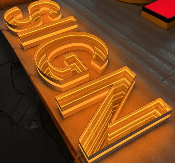
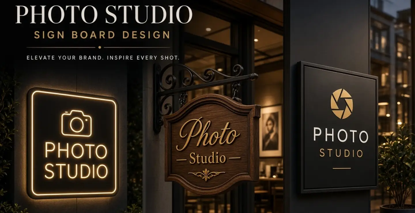
LED Backlit Boards
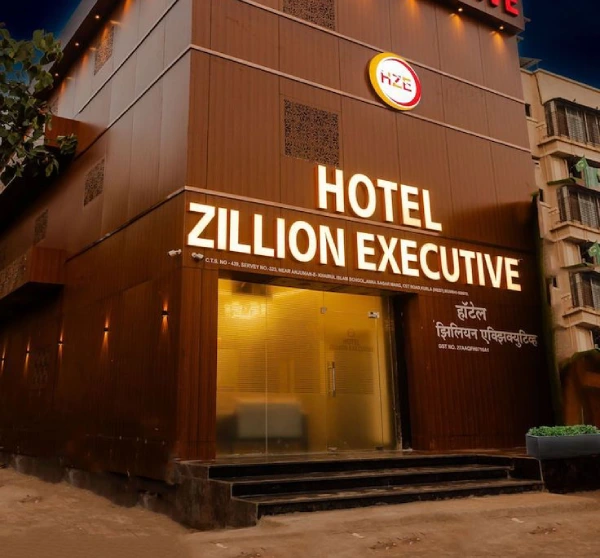
Backlit boards make your studio visible at night and give a bright, premium look. They are well suited to street-facing studios.
3D Acrylic or Metal Letters
Raised letters add depth and style. With soft lighting behind them, they create a glow that feels cinematic.
Neon-Style Signs
LED neon in a studio logo or a short phrase can be a stylish indoor feature. It also works well as a photo backdrop that clients love sharing online.
Wooden Signs
Wood gives a warm, handcrafted feel that suits portrait, family and lifestyle studios, especially when paired with metal lettering.
Glass Frosting and Window Graphics
Frosted vinyl or printed window graphics add privacy and style. They can display your logo, timings and key services without needing another full board.
Using Photography on the Sign
It is tempting to place large photos on the main board. This works best on indoor displays or window panels, where people can see details. On outdoor boards, photos can look small or messy from far away. If you use images, choose one strong, simple picture with good contrast. Otherwise, keep the main sign focused on your name and a clear message, and use window displays or a display frame near the door for your portfolio samples.
Lighting and Mood
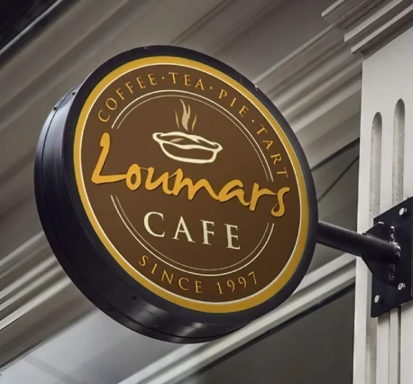
As a photographer, you understand light better than most. Apply that understanding to your signage. Use soft, even lighting to avoid harsh glare. Warm white lights feel inviting, while cool white feels clean and modern. At night, a well-lit board turns your studio into a visual landmark. If your studio is on an upper floor, add a vertical or projecting sign at street level so people know where to go.
Reception and Interior Signs
Your branding should continue inside. A logo wall behind the reception desk, a neat price board, studio room names, and a framed policy or booking notice help create a complete brand experience. Use the same fonts and colours as your outdoor sign so everything feels consistent.
Mistakes to Avoid
- Using many photos on the main outdoor sign.
- Choosing thin or hard-to-read fonts.
- Overloading the board with services and phone numbers.
- Ignoring night visibility.
- Using different styles across board, logo and social media.
Seasonal and Promotional Signage
Photo studios often see busy periods around wedding seasons, festivals and school admission time. A flexible signage plan lets you promote offers without changing the main board. Use a small stand or window panel for seasonal packages such as pre-wedding shoots, baby photography or festival family portraits. Digital screens or lightweight vinyl panels can be updated cheaply. Keep your main sign clean and permanent, while temporary promotions live on separate, easily replaceable displays. This keeps the studio looking premium while still allowing timely marketing.
Frequently Asked Questions
Which sign type suits a small photo studio?
An LED backlit acrylic or ACP board with simple lettering suits most small studios. It looks professional, stays visible at night and is easy to maintain.
Should the sign show a camera icon?
A camera or lens icon makes your business instantly recognisable, but keep it simple and clean. A tidy wordmark with a small icon often looks more premium than a complex illustration.
How do I make my studio sign Instagram friendly?
Add a neon-style logo or a neat wall sign inside the studio, where clients can take photos. Include your social media handle in small text so people can find and tag your work easily.
What size should a photo studio board be?
Size depends on the shop front and street width. Measure the space above the entrance, leave comfortable margins and choose letter heights that remain readable from across the road.
Final Thoughts
A photo studio sign board should be a small example of your own work: balanced, well composed and thoughtfully lit. When your sign is clear, stylish and consistent with your brand, it invites the right clients and sets high expectations before they walk through the door.
Brand Signages can help you design a studio sign board that fits your style, from elegant backlit boards to 3D logo walls and neon-style features.