Nobody enjoys searching for a washroom. When someone needs one, they want to find it quickly, understand which door to use and feel confident that the space is clean and well managed. A good washroom sign board design makes this simple. It guides people, prevents awkward mistakes and quietly improves the image of your office, restaurant, mall, hospital, school or hotel.
This guide explains how to design washroom signs that are clear, inclusive and attractive, from symbols and colours to materials and placement.
Why Washroom Signage Deserves Attention
Washroom signs may look small, but they are some of the most used signs in any building. Visitors, customers and employees all depend on them. Poor signage causes confusion, wasted time and discomfort. Clear signage, on the other hand, supports hygiene, accessibility and a smooth visitor experience. It also reflects how carefully the business is run. A neat washroom sign suggests a clean, well-maintained facility.
Start With the Basics: Universal Symbols
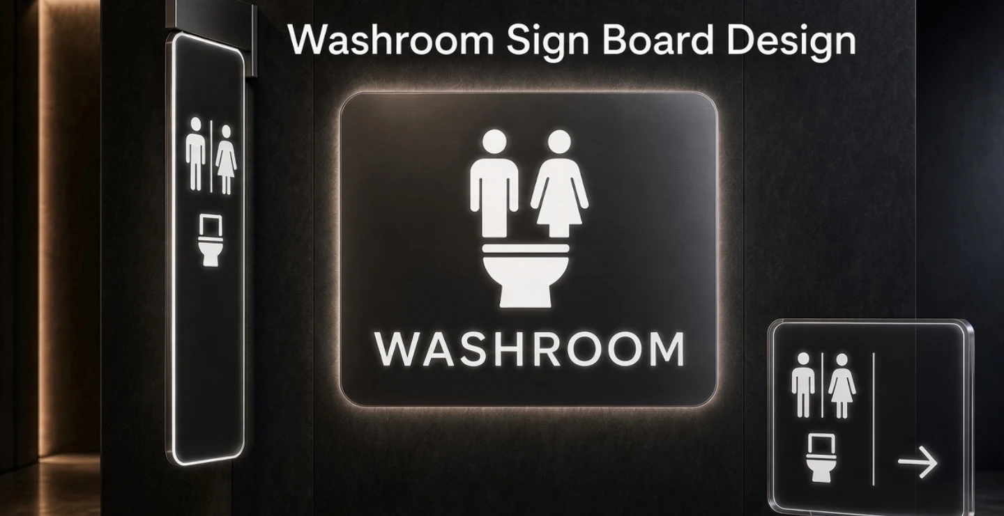
Symbols are the fastest way to communicate. Most people recognise the standard figures for men and women immediately, regardless of language. Use simple, widely understood icons rather than creative or confusing alternatives. A stylish symbol that people cannot decode defeats the purpose of the sign.
Include the common symbols where needed:
- Men's restroom figure for male washrooms.
- Women's restroom figure for female washrooms.
- Wheelchair symbol to mark accessible facilities.
- Baby-changing symbol where such facilities exist.
- Unisex or all-gender symbol for single-user washrooms, where applicable.
Pair every symbol with a short word label such as men, women, gents, ladies or toilet. This helps visitors who are unfamiliar with the symbols and supports people with low vision when the text is large and clear.
Choose Words That Everyone Understands
The right word depends on your location and audience. Terms such as washroom, restroom, toilet, gents and ladies are commonly used in different places. Choose the term your visitors know best. In multilingual areas, add the local language beside English. In hotels, airports and malls, bilingual signs help tourists and out-of-town visitors find facilities without asking for help. Keep wording short and avoid humour that might be misunderstood.
Colour Choices for Washroom Signs
Colours help people recognise signs quickly. Some businesses use blue for men and pink, red or purple for women. Others prefer a neutral style, such as black, white or grey, to match their interior. If you use colour coding, keep it consistent across the whole building. Whatever colour scheme you choose, make sure the symbol and text have strong contrast with the background. White on dark blue, black on white and white on dark grey are dependable combinations. Avoid placing a light-coloured symbol on a light-coloured background.
Typography and Readability
Use a clean sans-serif font with simple, open letters. Keep the text large enough to read from a few metres away and avoid decorative scripts. Capital letters can work for short labels such as MEN and WOMEN, while title case is easier for longer words. Make sure there is enough spacing around the text and icon so the sign does not look cramped.
Types of Washroom Sign Boards
Door Plates
Small signs fixed directly on the washroom door. They confirm the destination when the person is already at the entrance.
Wall-Mounted Signs
Placed beside the door, usually on the latch side so they remain visible when the door is open. These are widely used in offices, schools and hospitals.
Projecting or Hanging Signs
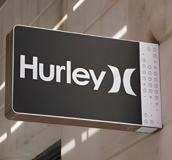
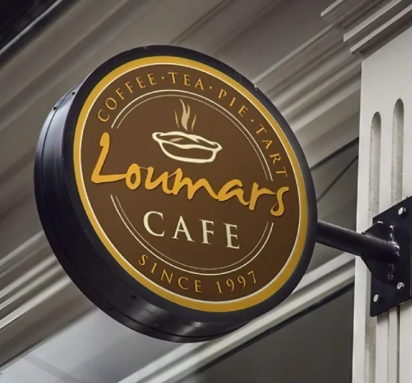
These stick out from the wall or hang from the ceiling so they can be seen from far down a corridor. They are helpful in malls, airports, restaurants and large offices.
Directional Signs
Arrows with washroom symbols guide people through corridors, floors or outdoor areas. Place them at junctions and decision points.
Outdoor Washroom Signs
Parks, petrol pumps, bus stands, resorts and event venues need weather-resistant boards that are easy to read in sunlight, rain and low light.
Material Options
- Acrylic: Popular for offices and commercial spaces. It looks modern, can be printed in colour and is easy to clean.
- Stainless steel or brass: Durable and elegant, suited to hotels, institutions and premium buildings.
- Aluminium and ACP: Lightweight and economical, good for large directional signs and outdoor boards.
- Vinyl stickers on glass or doors: A budget-friendly option for quick installation.
- Wood: Adds a warm touch for cafes, resorts and boutique spaces when sealed against moisture.
Because washrooms are humid environments, choose materials that resist moisture and can be wiped clean. Avoid materials that swell, peel or rust quickly.
Accessibility and Inclusive Design
Washroom signage should work for everyone. Large lettering, strong contrast and matte finishes make signs easier to read for older adults and people with low vision. Tactile symbols or Braille on key signs can help visually impaired visitors, particularly in public buildings. Mark accessible washrooms clearly, and make sure the path to them is also signposted. Where single-occupancy or all-gender washrooms exist, a clear sign helps everyone use them without confusion. Check any accessibility rules that apply in your area, since requirements for sign height, contrast and tactile features can vary.
Placement Tips
Mount signs at a consistent height, usually near eye level, so people know where to look. Place door signs on the door or on the wall beside it, and avoid spots where an open door could hide the sign. Put directional signs at corridor intersections, near lifts and staircases, and at the entrance to each floor. In large buildings, a first sign should appear before the turning point, not after it. Keep the surroundings free of posters or clutter that compete for attention.
Style and Brand Matching
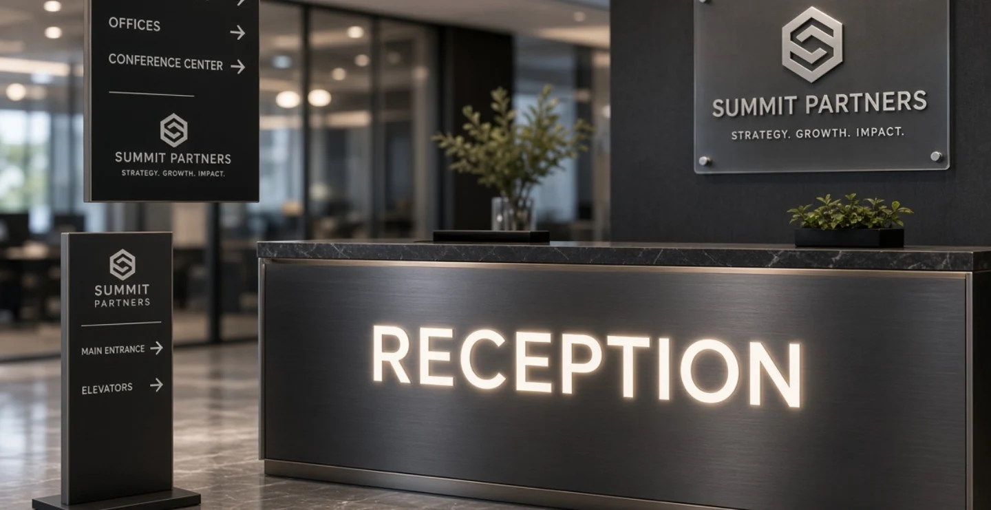
Washroom signs can still reflect your brand. A modern office may use frosted acrylic with a clean icon. A heritage hotel may choose brass plates with elegant lettering. A kids' play centre could use friendly colours and rounded icons. A restaurant might use wood and metal to match the interior. The key rule is that style should never reduce clarity. The symbol and label must remain obvious.
Hygiene and Behaviour Signs
Many facilities also need small notices such as wash your hands, wet floor, please keep the washroom clean, do not flush waste or occupied and vacant indicators. Use a consistent style and a polite tone. Short, friendly messages work better than strict commands. Place them at eye level near sinks and doors, and keep them in good condition so they do not look worn out or untidy.
Common Mistakes to Avoid
- Using unusual symbols that people cannot recognise.
- Choosing tiny text or low-contrast colours.
- Placing signs where doors or furniture block them.
- Mixing many different styles across floors.
- Using materials that peel, rust or fade in humid conditions.
- Forgetting directional signs in large buildings.
Maintenance
Wipe signs regularly with a soft damp cloth and mild cleaner. Avoid harsh chemicals that can damage printing or finishes. Check adhesives, screws and brackets for looseness, especially in busy areas. Replace faded or broken signs promptly. A clean sign next to a clean washroom builds trust with visitors.
Frequently Asked Questions
What size should a washroom sign be?
Door plates are often small to medium, while directional and hanging signs are larger. Choose the size based on how far people will be when they first need to read it.
Should I use text along with symbols?
Yes. Symbols give quick recognition, and text adds clarity, especially for people who find symbols unfamiliar or have vision difficulties.
Which material is best for humid washrooms?
Acrylic, stainless steel, brass and quality aluminium handle moisture well. Avoid untreated wood, paper or low-quality materials that absorb water.
Final Thoughts
The best washroom sign board design is simple, consistent and easy for everyone to understand. Use universal symbols, readable text, strong contrast and suitable materials, and place signs where people naturally look. With these basics in place, your washroom signage will guide visitors smoothly and support the image of a clean, thoughtful business.
Brand Signages can help you plan washroom and directional signs that match your building, brand and budget.