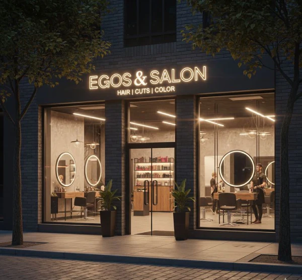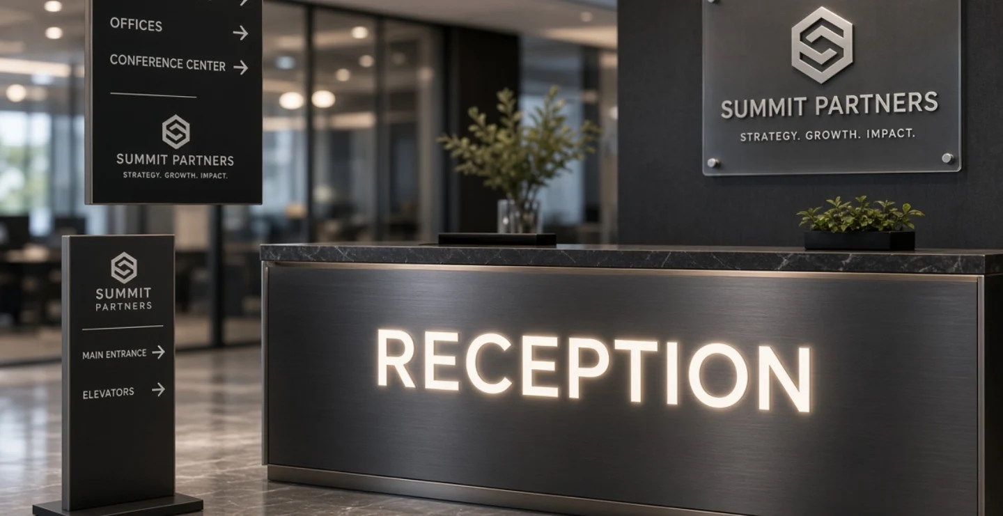
The reception area is where your business shakes hands with the world. Clients, candidates, vendors and guests spend their first minutes there, and they notice everything: the lighting, the cleanliness, the staff and the wall behind the desk. A well-planned reception sign board design turns that wall into a confident statement of who you are.
This guide explains how to design reception signs for offices, clinics, hotels, showrooms, salons, schools and other businesses, including layout, materials, lighting and common mistakes.
Why Reception Signage Matters
Visitors judge a company quickly. When they walk into a reception that has a bright, neat logo wall, they feel they have arrived at a serious, established organisation. When the wall is blank or covered with scattered notices, the impression is weaker. Reception signs also help with practical needs. They tell visitors where to check in, where to wait and how to find different departments. A good sign supports both branding and navigation.
Main Types of Reception Signs


Logo Wall Sign
The large company name and logo placed behind or above the reception desk. It is the centrepiece of the area and often appears in photographs, video calls and social media posts.
Reception Desk Sign
A smaller sign on the front of the desk or on the counter that says reception, welcome or enquiries. It guides visitors who may not notice the main wall at first glance.
Directory Board
A list of departments, floors, doctors, teams or tenants with room numbers or directions. It is helpful in multi-floor offices, hospitals, business centres and educational institutions.
Visitor Instruction Signs
Small boards that say please sign in, visitors must collect a pass, wait here, or show ID. They keep movement organised and help security and front-desk staff.
Awards and Values Wall
Boards that display company mission, values, certifications or achievements. When designed carefully, they build credibility without overwhelming the space.
Waiting Area Signs
Notices about Wi-Fi, refreshments, washrooms, timings or token systems that make the waiting experience more comfortable.
Designing the Logo Wall
The logo wall is the star of the reception. Begin with high-quality logo files so the final sign is sharp. Decide whether the logo will appear alone or with a tagline. In most cases, a simple name and logo looks more premium than a crowded design. Leave generous empty space around the sign so it can breathe. The size should be proportionate to the wall and visible from the entrance, but not so large that it overwhelms the room.
Consider the wall behind it. A plain, neutral wall makes the sign stand out. A textured wall, such as wood panelling, stone cladding or a painted accent colour, can add depth. Always check contrast so that the logo remains readable against the background.
Popular Reception Sign Styles
- 3D acrylic letters: Raised letters with a smooth, modern finish. They can be painted in brand colours or mirror finishes.
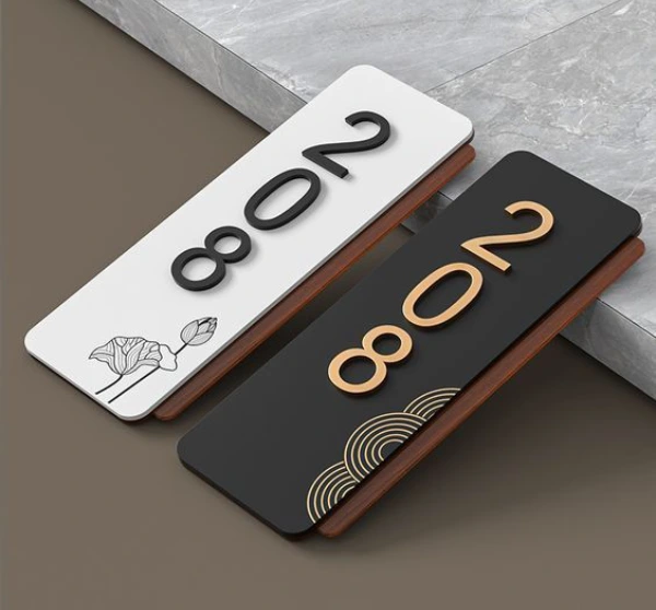
- Metal letters: Stainless steel, brass or aluminium letters create a premium, corporate look. Brushed gold and rose gold are popular.
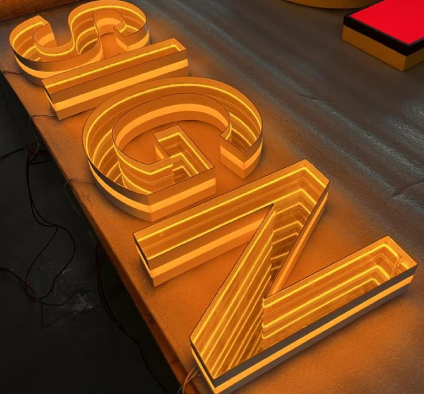
- Backlit letters (halo lit): Light shines behind the letters, creating a soft glow on the wall. This looks elegant and sophisticated.
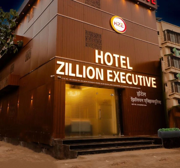
- Front-lit letters: Letters themselves glow, which makes them bold and highly visible.
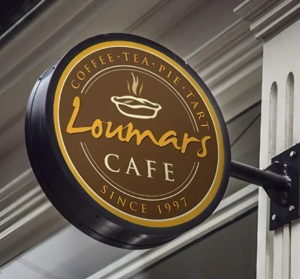
- Wooden logo boards: Warm and welcoming, good for creative studios, cafes and boutique offices.
- Layered panels: Combining acrylic, metal and wood for depth and texture.
- Neon-style LED signs: Trendy and eye-catching for modern, youthful brands.
Colour and Material Choices
Your reception sign should reflect your brand colours but also work with the interior. Corporate offices often prefer neutral tones with one accent colour. Healthcare reception areas lean towards calm blues and greens. Hotels and luxury showrooms may use gold, black or deep tones. Creative agencies can use bold colours and unique shapes. Select materials that suit the environment. Metal and acrylic give a modern look. Wood adds warmth. Glass adds elegance and openness. Avoid mixing too many materials and finishes, since a calm, consistent look feels more professional.
Lighting Matters
Lighting can transform a reception sign. Backlighting creates a premium glow, while spotlights highlight the logo and texture. Ensure the light is even and not too harsh. Warm white feels welcoming and cosy, while cool white gives a clean, modern atmosphere. Be careful with reflections on glossy surfaces, particularly near windows. If the area is used for video calls or photos, test how the sign looks on camera.
Placement and Height
The sign should be visible from the main entrance and from the seating area. A common practice is to place the logo above eye level on the wall behind the reception desk, so it is clearly seen without being blocked by staff or furniture. Avoid placing it where plants, screens, doors or lights hide part of it. For directory boards, use eye-level placement near the entrance or lift lobby so visitors do not need to walk far to find information.
Consistency With Brand and Interior
Your reception sign should look like part of the interior design, not an afterthought. Match fonts, colours and style with the rest of your branding, such as website, brochures and uniforms. Coordinate it with furniture, flooring and wall colours. When the sign, desk and walls work together, the entire space feels intentional and polished.
Accessibility and Clarity
Directory and instruction boards should be easy to read for everyone. Use large, clear text with good contrast and avoid glare. Keep information concise and updated. If you serve visitors with different language needs, include bilingual labels. Make sure signs do not block pathways and that the reception area remains easy to navigate for people using wheelchairs or mobility aids.
Maintenance and Updates
Dust accumulates on 3D letters and shelves, so clean the sign regularly using a soft cloth. Check lighting and replace failed LEDs promptly. Update directory boards whenever teams, rooms or departments change, because outdated information is confusing. If your company rebrands, plan the replacement carefully so the new sign matches the new identity.
Common Mistakes to Avoid
- Using a low-resolution logo that looks blurry when enlarged.
- Making the sign too small for the wall or too large for the room.
- Choosing poor lighting or glare that reduces readability.
- Cluttering the reception wall with too many notices.
- Mixing styles and fonts that do not match your brand.
- Forgetting wiring and power planning for illuminated signs.
Frequently Asked Questions
What is the best material for a reception logo wall?
Acrylic and metal are popular for their clean, premium look. The best choice depends on your brand, budget and interior style.
Do I need lighting for a reception sign?
Lighting is not compulsory, but it greatly improves visibility and style. Backlit or spotlit signs look more premium, especially in evening hours.
How big should a reception logo be?
It should be proportional to the wall and visible from the entrance. Making a paper or digital mock-up on the wall helps you judge the right size before production.
Final Thoughts
A strong reception sign board design combines branding, lighting and clear communication. It welcomes visitors, supports navigation and shows that your business values detail. With the right material, balanced layout and thoughtful placement, your reception wall becomes one of your most valuable brand assets.
Brand Signages can help you plan reception signs in the right style, size and lighting for your office or business space.