Every retail store has a silent salesperson that works from opening time to closing time: the sign board. It tells people who you are, what you sell and whether you are worth a visit. A thoughtful store sign board design can bring in walk-in customers, strengthen your brand and make your shop easier to remember than the one next door.
This guide covers how to plan a store sign that works for general stores, clothing shops, grocery stores, electronics shops, gift stores and other retail businesses.
What a Store Sign Board Must Do
A good store sign has four tasks. It must be seen from a distance, be understood within seconds, reflect your brand personality and stay in good condition. If it fails at any of these, it wastes the best advertising space you own. The sign should answer two questions quickly: what is this place, and is it for me?
Start With Your Brand
Before designing, define your store identity. Who are your customers? A premium fashion boutique needs refined, elegant signage. A kids' toy store can be colourful and playful. A grocery or general store should look reliable, clean and welcoming. An electronics shop might favour a modern, high-tech style. Choose a name, logo, colours and fonts that fit the kind of shopping experience you want to offer.
Key Elements of a Store Sign Board
Store Name
The name is the main element and should be the easiest thing to read. Make it large, clear and well spaced.
Category Line
Add a short phrase explaining what you sell, such as family clothing, mobile and accessories, kirana and general store, gifts and toys or home appliances. It helps people who do not know your brand decide quickly.
Logo
A simple logo makes the store memorable. It should look good on the sign, shopping bags, bills, social media and uniforms.
Contact Details
Phone number, website or social media handle can be placed in smaller text, mainly for ordering, delivery or enquiries.
Optional Details
Brands you stock, home delivery, payment options or the year you started can be added if there is enough space, but never at the cost of clarity.
Colour Strategy for Retail Stores
Colour affects mood and recognition. Red and orange suggest energy and sales, making them popular for discount and general stores. Blue feels trustworthy and is common for electronics, banking and services. Green suggests freshness and works for organic and grocery shops. Black, gold and white convey luxury and suit jewellery, fashion and premium gifts. Yellow attracts attention quickly and works well when paired with black or dark blue. Choose a primary colour, a secondary colour and a neutral. Keep them consistent across the store.
Typography That Sells
Select fonts that match the store but remain readable. Bold sans-serif fonts are strong for most retail shops. Elegant serif or script fonts suit boutiques and premium brands. Do not use more than two fonts. Keep letter spacing comfortable and avoid squeezing text to fit more words. If you need to add a regional language, keep it balanced with English so the sign remains neat.
Types of Store Sign Boards
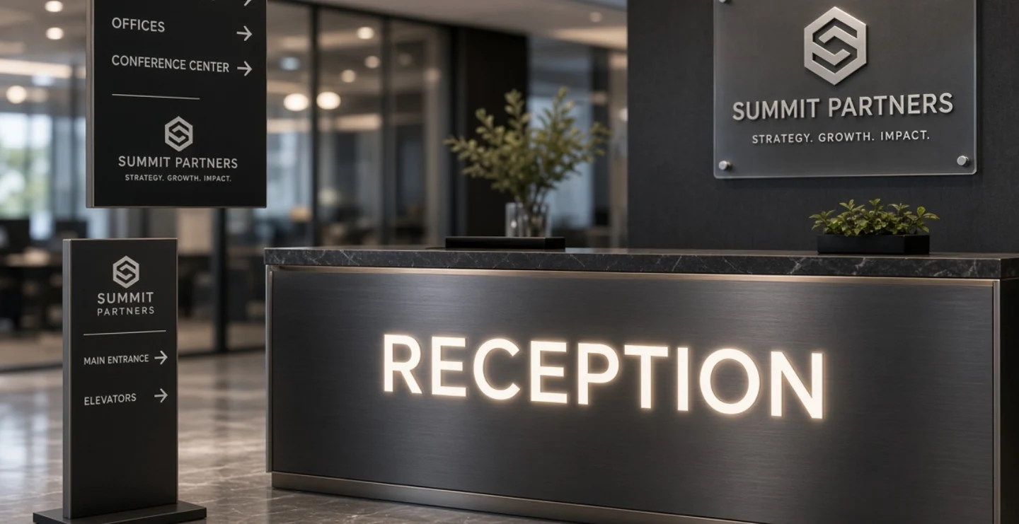
Fascia Boards
The classic board above the store entrance. It can be made from ACP, acrylic, flex, metal or a combination. This is the main identity sign.
LED Backlit Signs
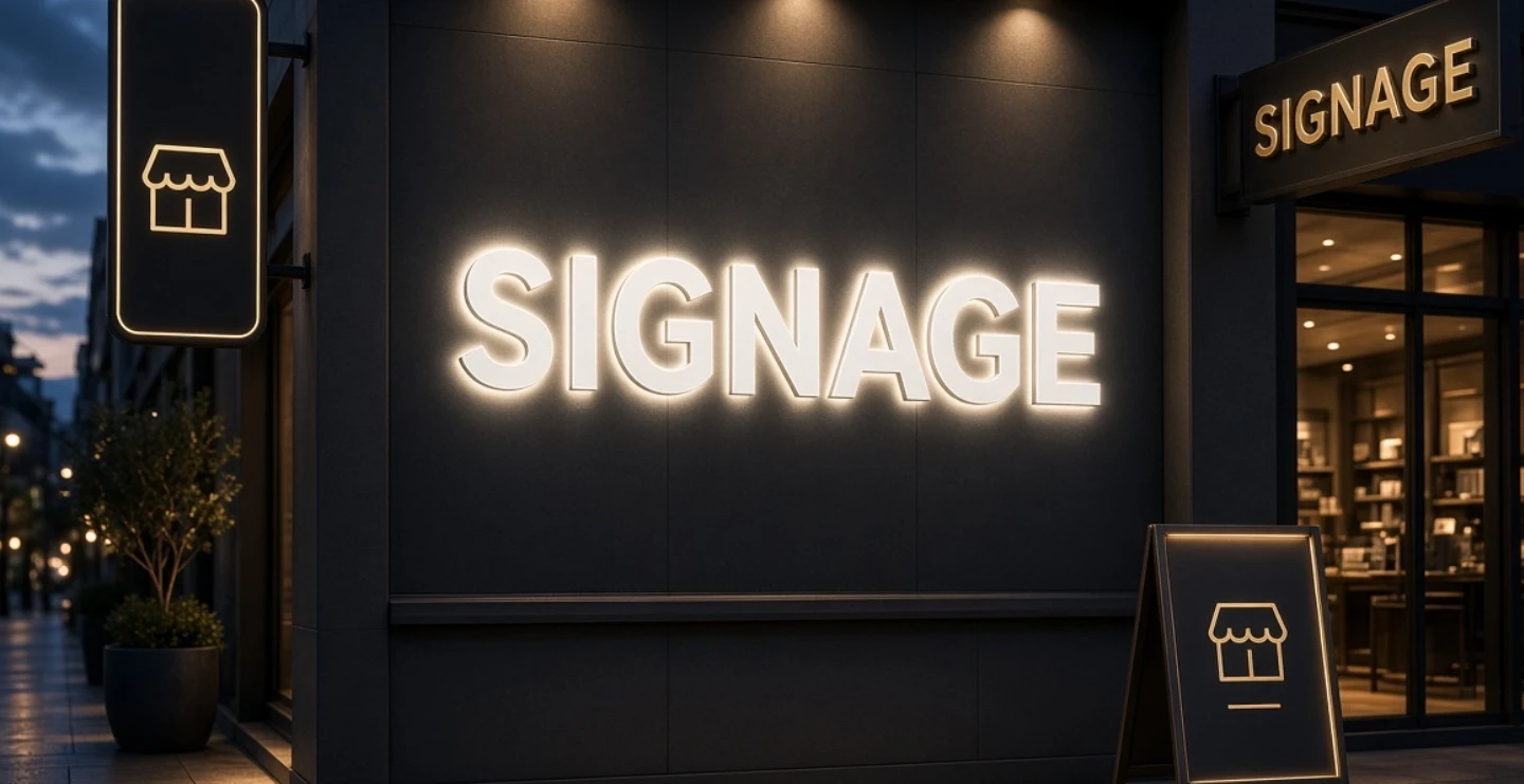
Glowing boards that stay visible at night and make the store look modern. They are widely used by retail shops that are open into the evening.
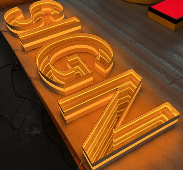
3D Letter Signs
Raised letters in acrylic, steel or aluminium give depth and a premium feel. With lighting, they create a striking effect on walls and fascia panels.
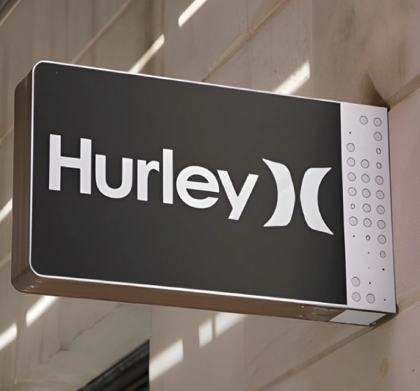
Projecting and Blade Signs
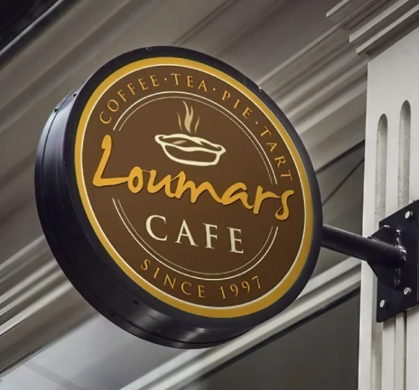
Boards that stick out from the wall at a right angle so people walking along the street can spot the shop from either direction. They are very helpful in markets and high streets.
Pylon and Totem Signs
Tall freestanding signs used by stores in complexes, roadside locations or shopping centres to attract attention from a distance.
Window Graphics
Vinyl lettering and frosted designs on glass show timings, offers, brands and social media handles. They add information without needing another large board.
Sizing and Placement
The sign should suit the width of your shop front while leaving some margin on both sides. Place it above the entrance where it is visible from the road and not blocked by trees, wires, awnings or other boards. For shops on upper floors or inside lanes, add a ground-level or vertical sign so customers know you are there. Think about how far away people will be when they first look for you and size the lettering accordingly.
Lighting for Retail Success
Lighting extends your selling hours. LED backlit boards, spotlights and illuminated letters keep the shop visible after sunset. Warm white lighting gives a friendly, inviting look, while cool white suggests a clean, modern store. Make sure the lighting is even, without dark corners or glare. Combine sign lighting with proper shop front lighting so the entire store looks open and welcoming.
Using Your Sign Inside the Store
Your outdoor sign is the beginning of the customer journey. Inside, use consistent signs to guide shoppers: category boards, price tags, offer displays, billing counter signs and exit signs. Use the same fonts and colours, so the entire store feels organised. A clear logo wall behind the billing counter strengthens brand recall and looks good in customer photos.
Seasonal and Offer Signage
Festivals, sales and new arrivals need flexible promotion. Instead of changing the main board, use window posters, stand banners, hanging signs or small boards near the door. This keeps your permanent sign clean while allowing quick updates. Always remove outdated offers promptly so the store does not look neglected.
Common Store Signage Mistakes
- Too much text and too many phone numbers on the main board.
- Low contrast between letters and background.
- Choosing cheap materials that fade or break within months.
- Ignoring night visibility.
- Using different styles for the sign, bags, bills and social media.
- Not checking local rules or permissions for signage size and placement.
Maintenance Tips
Clean the sign regularly to remove dust and stains. Replace damaged lights quickly, and repair peeling vinyl or cracked panels. Check frames, brackets and wiring before the rainy season. A neat sign tells customers that the store takes care of details, which builds confidence in the products and service.
Frequently Asked Questions
What is the best material for a store sign board?
ACP, acrylic and metal are durable and look professional. Flex is the most economical, while LED backlit and 3D signs offer a premium look for stores that can invest more.
How much information should be on the sign?
Keep it to the store name, a short category line and perhaps a contact detail. Use window graphics and inside displays for everything else.
How often should a store sign be replaced?
It depends on material and weather. Replace or refresh it when colours fade, lights fail, edges crack or when you rebrand.
Final Thoughts
A strong store sign board design is clear, consistent and built for visibility. It tells customers who you are, what you sell and why they should step inside. Invest in good design, durable materials and proper lighting, and your sign will keep working for your business every single day.
Brand Signages can help you plan a store sign board that suits your shop front, brand and budget.