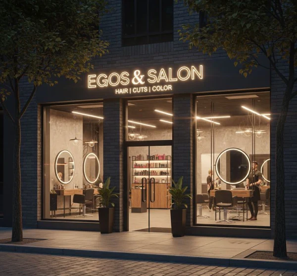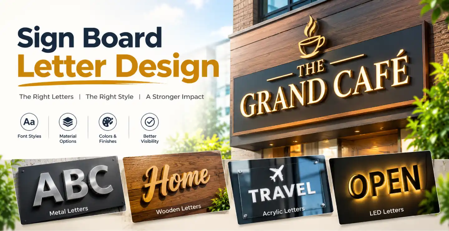
A sign board can have the best location, the brightest lights and the finest materials, yet still fail if people cannot read it easily. Letters are the heart of any sign. Sign board letter design decides whether a message is understood in two seconds or ignored altogether. The right font, size, spacing and colour turn simple text into a powerful marketing tool.
This guide explains the basics of letter design for sign boards in simple language, so you can make better choices for your shop, office or brand.
Why Letter Design Matters
Letters do two jobs at once. They carry information, such as your name, and they express personality. A bold, modern typeface suggests a contemporary business. A graceful script feels elegant or traditional. A rounded, friendly font feels approachable. If the letters are hard to read, the personality is lost along with the message.
People often view signs from far away, at an angle or while moving. Good letter design handles all of these situations.
Understanding Font Categories
Sans-Serif Fonts
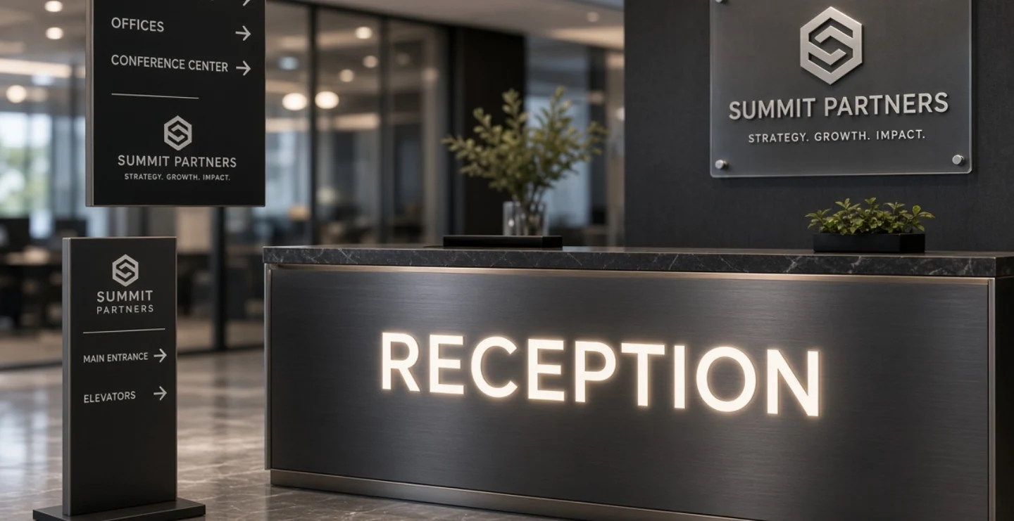
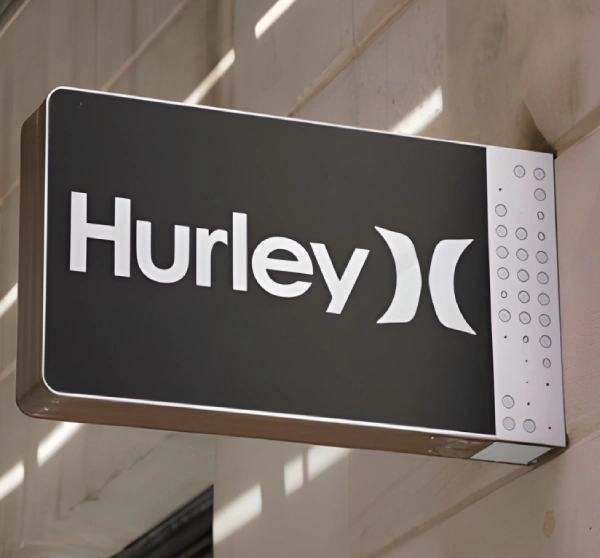
These fonts have clean lines without small decorative strokes. They are the most popular choice for sign boards because they remain clear at a distance and look modern. They suit shops, clinics, offices and most commercial boards.
Serif Fonts
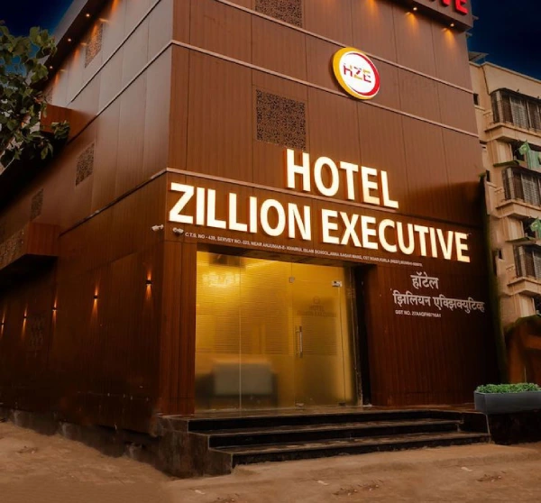
Serif fonts have small finishing strokes on letters and feel traditional, formal and trustworthy. They are often used by law firms, jewellers, banks, hotels and heritage brands. For small text on distant boards, they can be harder to read, so use them for larger names.
Script and Calligraphy Fonts
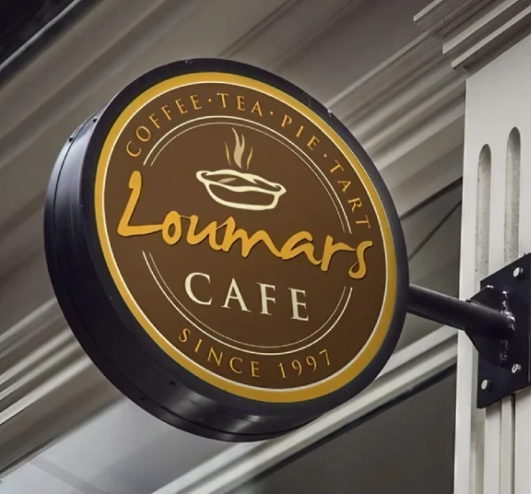
Flowing, handwritten styles add elegance and personality. They are good for boutiques, salons, bakeries and wedding services. Use them sparingly and in large sizes, because they lose clarity when small or tightly spaced.
Display and Decorative Fonts
These are bold, unusual styles designed for attention. They can work for short names but are risky for longer messages. Always test them from a distance before approving.
Regional Language Fonts
Boards in Hindi, Bengali, Tamil, Marathi and other languages need fonts designed carefully for their scripts. Ensure the letters are balanced, clear and well spaced, and match the visual weight of any English text on the same board.
Letter Height and Viewing Distance
The farther away viewers are, the larger the letters must be. A practical approach is to estimate how far people will be when they first need to read the sign, then size the letters so they are comfortably readable from that point. A shop viewed from a narrow lane can use smaller lettering than a showroom facing a wide highway. When in doubt, go bigger, and shorten the text rather than shrinking the letters.
Spacing Makes or Breaks Readability
Three kinds of spacing deserve attention. Letter spacing, called tracking, affects how open or tight a word looks. Slightly wider spacing improves readability on signs, especially in capital letters. Line spacing should leave enough gap so lines do not touch or crowd. Word spacing should separate words clearly. Also check the space between letter pairs, since some combinations look uneven and need manual adjustment, a process called kerning.
Uppercase vs Lowercase
All capitals look strong and formal, and work well for short names and logos. However, long sentences in capitals become harder to read. Mixed case, with the first letter capitalised, is easier for phrases and descriptions. A common approach is capitals for the business name and mixed case for taglines.
Colour and Contrast for Letters
Letters must stand out from the background. Strong combinations include black on white, white on dark blue, yellow on black and white on red. Avoid pale letters on pale backgrounds or busy images behind text. If a photo or pattern must be used, place a solid panel behind the lettering. Remember lighting, too. Letters on an illuminated board may look very different by day and by night, so check both.
Types of Sign Board Letters


- Flat cut letters: Cut from acrylic, metal or sheets and pasted on a surface. Clean and economical.
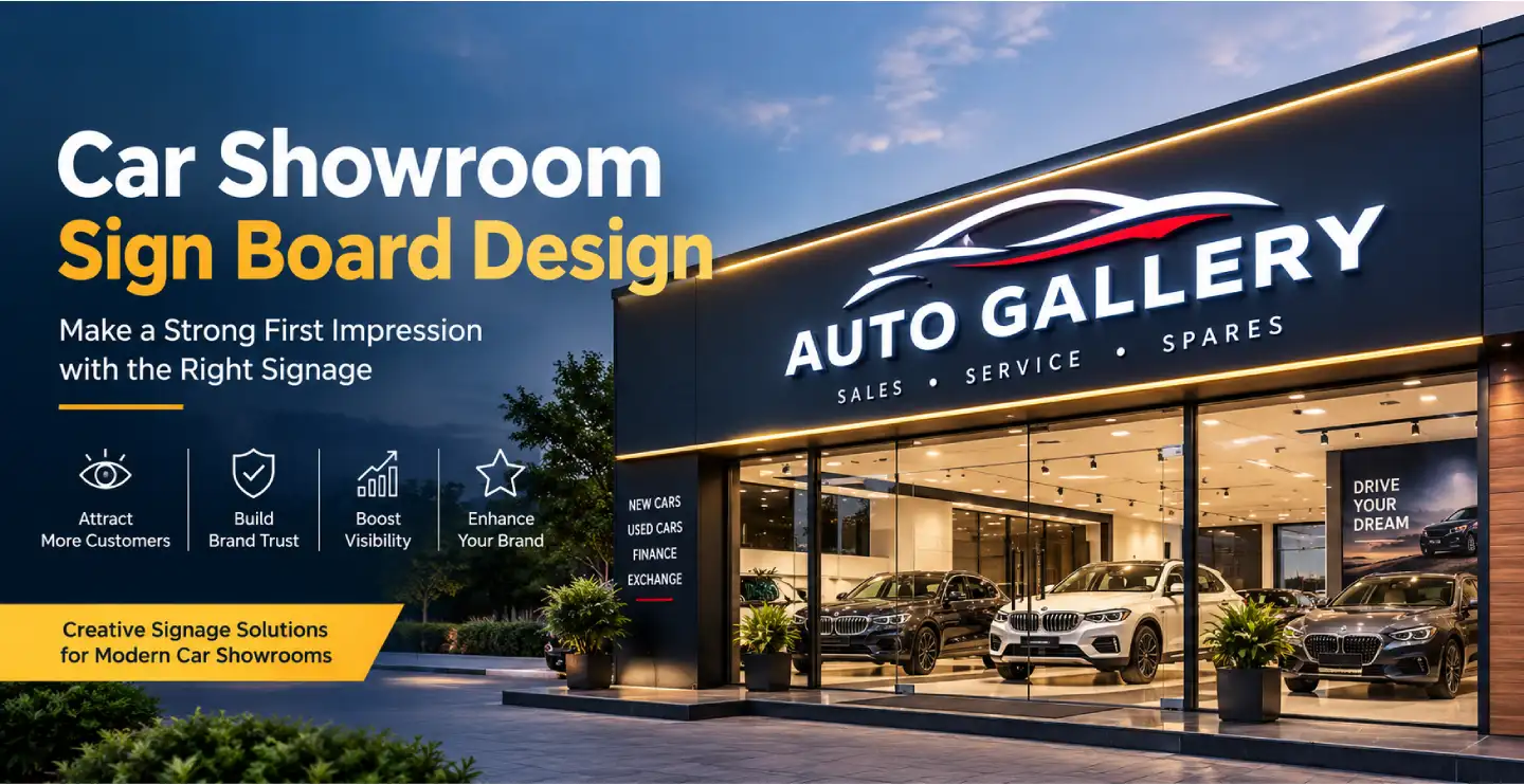
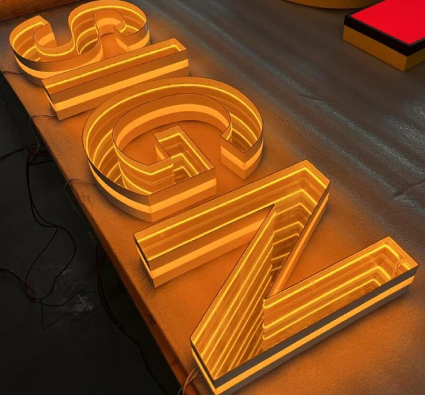
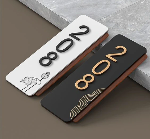
- 3D raised letters: Have thickness and cast shadows, giving a premium look. Made from acrylic, steel, aluminium, brass or foam.
- Backlit letters: Light shines behind the letters, creating a halo effect on the wall.
- Front-lit letters: Light glows through the face of the letters, making them bright and bold.
- Neon-style LED letters: Flexible light strips shaped into words for a trendy, eye-catching effect.
- Vinyl letters: Adhesive letters used on glass, boards and vehicles, ideal for quick, budget solutions.
Matching Letters to Your Brand
Your letters should match the personality of your business. A hospital needs clear, calm and simple lettering. A children's store can use playful, rounded shapes. A luxury jewellery shop may use refined, high-contrast serif styles. If you already have a logo, use the same typeface or one that complements it, so signage, visiting cards, packaging and website all look connected.
Mistakes to Avoid
- Using too many font styles on one board.
- Choosing a font that looks great on screen but is unclear from far away.
- Making letters too thin for outdoor visibility.
- Reducing spacing to fit more text.
- Ignoring contrast and background colour.
- Not checking spelling before production.
Quick Testing Tips
Before finalising, print the design at a smaller scale and view it from a distance. A simple trick is to step back until the text is almost unreadable and see whether the key message still stands out. You can also ask a few people who have not seen the design to read it quickly and tell you what they understood.
Letter Design for Different Business Types
Different businesses benefit from different lettering styles. Medical stores and clinics do well with clean sans-serif letters that feel safe and clear. Jewellery and fashion boutiques often use elegant serif or script styles. Restaurants and cafes can use friendly, slightly rounded or hand-drawn lettering. Technology and consulting firms favour modern, geometric fonts. Educational institutions prefer balanced, readable styles that feel trustworthy. Whatever your business, the aim is the same: make the name the easiest thing to read, then let the style add personality.
Frequently Asked Questions
What is the best material for sign board letters?
Acrylic is popular for its clean finish and colour options. Stainless steel and aluminium are durable for outdoor use, while brass gives a premium look. The best choice depends on budget, location and style.
Are 3D letters worth the extra cost?
For brands that want a premium appearance, yes. Raised letters create depth and shadow, and with lighting they stand out strongly. For simple needs, flat letters can be more economical.
Can I use my own custom font?
Usually yes, as long as you have the rights to use it and can provide the font or outlined artwork. Always check that the letters remain readable at the final size.
Final Thoughts
Good sign board letter design is not about fancy effects. It is about clear communication wrapped in the right personality. Choose readable fonts, size them for distance, respect spacing and use strong contrast. Do this, and your sign will be noticed, understood and remembered.
Brand Signages can help you choose the right lettering style and material, from flat cut letters to illuminated 3D signs, for your business.