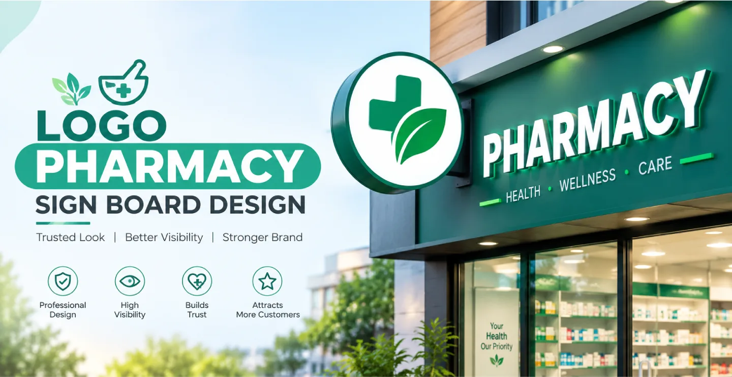
People visit a pharmacy when they need something important: medicine, advice or reassurance. They want to feel that the store is clean, reliable and professional. Your sign board is the first signal. A smart logo pharmacy sign board design combines a clear logo, recognisable healthcare symbols and readable lettering to help customers find you quickly and trust you immediately.
This guide covers how to create a pharmacy logo, how to turn it into an effective sign board and which colours, materials and lighting work best for medical stores.
Why the Logo Matters for a Pharmacy
Pharmacies often look similar from the outside, and in many areas several are located within a short distance. A distinctive logo helps your store stand out and be remembered. When customers think of your pharmacy, they should picture a particular name, colour and symbol. Over time, this recognition builds loyalty, especially when the logo is used consistently on the sign board, bills, medicine covers, delivery bags, uniforms and social media.
Elements of a Good Pharmacy Logo
A Clear Name
The pharmacy name should be simple, easy to pronounce and easy to remember. Names that include words like medical, pharmacy, chemist, health or care help people understand the business instantly.
A Relevant Symbol
Common symbols include the green cross, the mortar and pestle, a capsule or tablet, a leaf for natural or Ayurvedic products, a heart for care, or the Rx symbol. Choose one main symbol and keep it simple. Too many icons make the logo confusing and hard to reproduce on a sign.
A Clean Layout
Most pharmacy logos use either a horizontal layout, with the symbol on the left and name on the right, or a stacked layout, with the symbol above the name. Test both layouts on your sign space to see which fits better.
Scalability
Your logo must look good both large and small. It will appear on a big outdoor board and also on tiny stickers or app icons. A simple design with clean shapes and limited colours works best.
Choosing Colours for a Pharmacy
Colour strongly influences how people feel about a healthcare business. Green is the most common pharmacy colour because it suggests health, nature and safety. Blue feels calm, clean and trustworthy. White gives a hygienic, professional look. Red can be used as an accent for emphasis, but too much red may feel urgent or alarming. Many pharmacies combine green and white, blue and white or green and blue. Keep your palette limited to two or three colours so the sign looks clean and the logo stays recognisable.
Typography for Pharmacy Boards
Choose a clear, professional font that is easy to read from a distance. Clean sans-serif styles are the safest choice. Avoid overly decorative or playful fonts, since customers expect a medical store to feel dependable. Make the pharmacy name the largest element, and keep supporting text such as 24-hour service, home delivery, generic medicines or surgical items smaller and well organised.
Types of Sign Boards for Pharmacies


LED Backlit Boards
Pharmacies are frequently visited in the evening or at night, so lighting is vital. Backlit boards make your logo and name visible from far away and give a modern, clean appearance.
3D Logo Signs
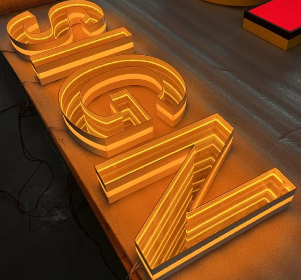
Raised acrylic or metal logos with lighting create a premium feel. The green cross or your custom symbol can be built as a glowing three-dimensional feature on the fascia or wall.
Projecting or Vertical Boards
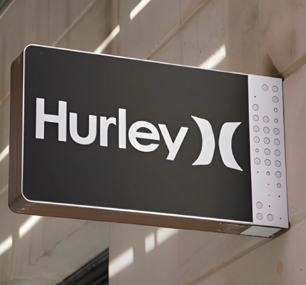
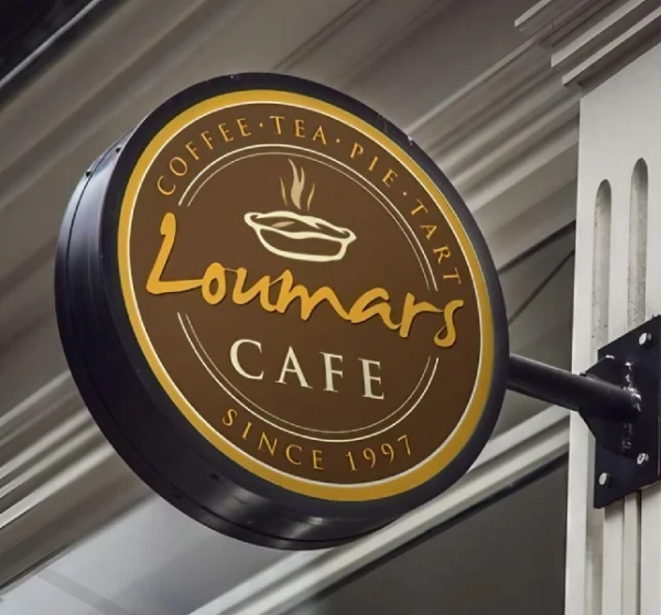
A vertical board with a cross or the pharmacy name makes the store visible from both directions of a street. This is especially useful in busy markets and narrow roads.
ACP and Vinyl Boards
These are economical and quick to produce. With quality printing and proper framing, they provide a neat, professional look for small stores.
Glass and Door Graphics
Window and door stickers can display timings, services, payment options and contact numbers without needing another large board.
Information to Include on the Sign
Keep the main board simple: logo, name and perhaps one short line like 24-hour pharmacy or medicines and surgical items. Add phone and home delivery information in a smaller size if needed. Pharmacies also operate under licensing and display rules, which differ by location, so check what must be displayed and where. Often such details are placed inside the store or on a separate notice rather than on the main sign. Avoid making medical claims or promises on your sign board, and keep the wording factual and responsible.
Lighting and Visibility
A bright, evenly lit board communicates that the pharmacy is open and ready to serve. Choose LED lighting with good brightness and a clean white or soft white tone. For a 24-hour store, consider additional lighting around the entrance so customers feel safe approaching late at night. Keep the glow comfortable and avoid harsh glare. The cross symbol can be lit in green, which is easy to recognise even from long distances.
Placement and Size
Place the main board above the entrance at a height where it is not blocked by trees, wires or neighbouring boards. In busy streets, add a vertical sign so people walking along the road can notice it. The size should match the width of the shop front, with enough margin around the logo so it does not feel crowded. Ensure the sign is visible from the road if your pharmacy is on an upper floor or inside a complex.
Brand Consistency Beyond the Sign
Your sign board is the start of your brand, not the end. Use the same logo, colours and fonts on your shop shelves, billing software, medicine bags, visiting cards, uniforms and website. When everything matches, the pharmacy appears organised and professional, which increases customer confidence.
Mistakes to Avoid
- Using a complicated logo that becomes unreadable when printed small.
- Copying another pharmacy's logo or a protected brand design.
- Using too many colours or decorative fonts.
- Ignoring night visibility and lighting.
- Crowding the board with too many services and phone numbers.
- Letting the sign fade, crack or stay half-lit.
Frequently Asked Questions
Can I use the green cross on my pharmacy sign?
The green cross is widely used as a pharmacy symbol, but rules and customs vary by country and region. Check local guidelines, and consider adding your own unique name, colour combination or icon so your logo remains distinctive.
Which sign is better for a pharmacy: flex or LED?
Flex is economical, while LED backlit boards are brighter, longer lasting and more suitable for night visits. If budget allows, LED gives a more professional impression.
How big should the logo be on the board?
The logo should be clearly visible but should not overpower the name. A balanced layout leaves comfortable space around both so neither feels crowded.
Final Thoughts
A strong logo pharmacy sign board design builds trust before a customer walks in. Keep the logo simple, the colours clean and the lighting bright, and use the same identity everywhere. A sign that feels clear, caring and professional can become one of your most valuable marketing tools.
Brand Signages can help you turn your pharmacy logo into a durable, well-lit sign board that suits your shop front and budget.