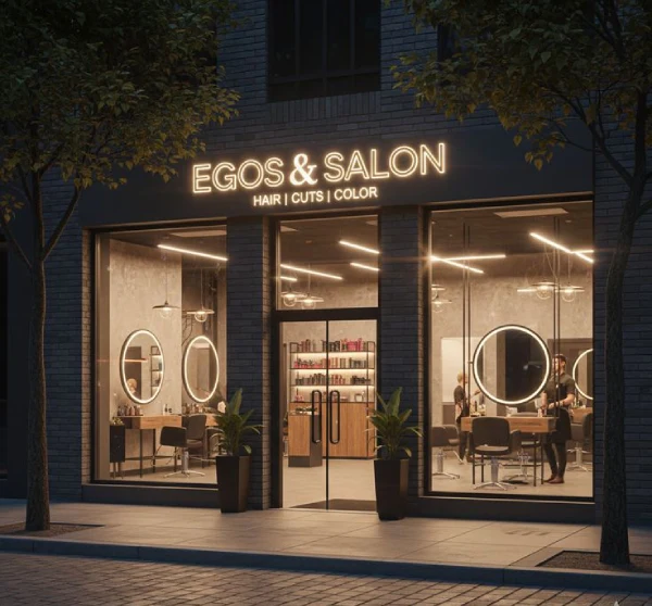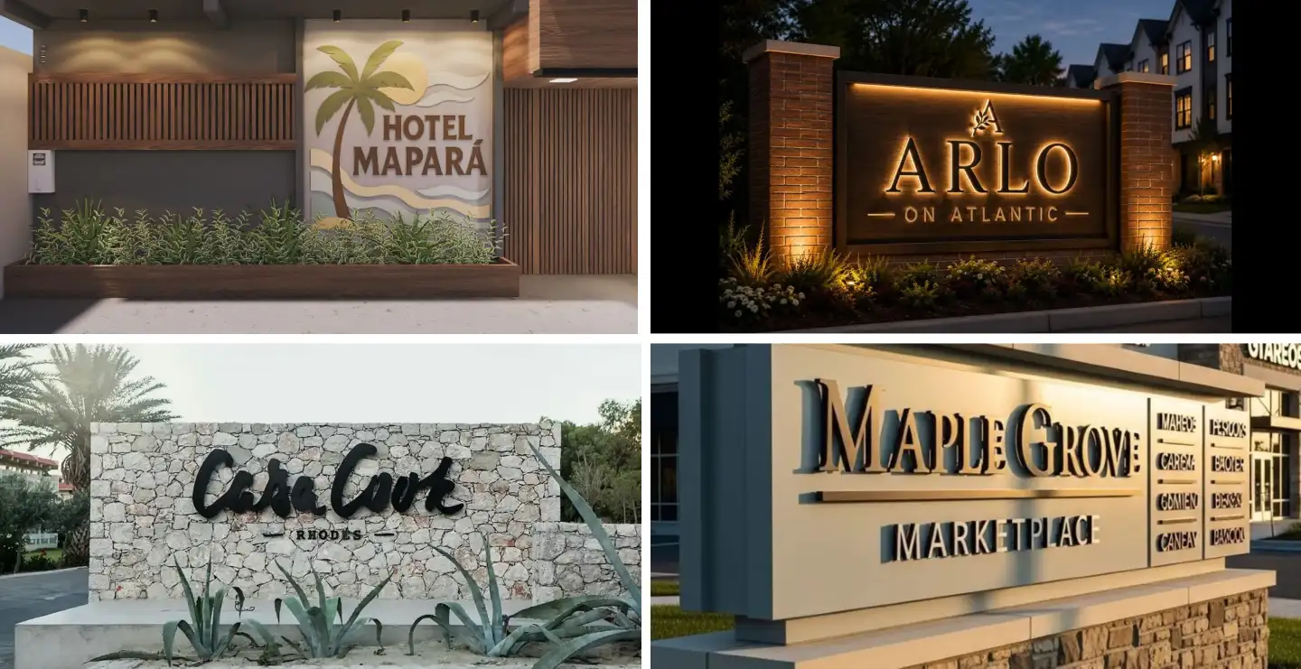
In a busy market or high street, an attractive sign board can be the difference between a customer noticing your business and walking right past it. Good design goes beyond simply printing a name in large letters; it uses colour, contrast, shape, and lighting to draw the eye and hold attention. If you want a sign board that genuinely turns heads, understanding the principles behind attractive sign board design is the first step.
This guide explains what makes a sign board attractive, why it matters, the key design elements involved, popular styles, and what to consider before finalising your own.
What Makes a Sign Board Attractive?
An attractive sign board is one that captures attention quickly, communicates its message clearly, and leaves a positive impression of the brand behind it. This is achieved through a combination of bold colour choices, balanced layout, quality materials, and often creative elements such as 3D lettering, illumination, or unusual shapes that break away from plain rectangular boards.
While attractiveness is partly subjective, certain design principles consistently perform well across different industries and locations, making signage more noticeable and more memorable.
Why Attractive Sign Board Design Matters
- Grabs attention in crowded commercial areas with heavy visual competition
- Improves footfall by making the business easier to notice and remember
- Builds a stronger, more polished brand image than plain or dated signage
- Encourages photo-worthy storefronts that customers may share on social media
- Differentiates a business from neighbouring shops with similar offerings
- Supports better nighttime visibility when paired with the right lighting choices
Key Elements of an Attractive Sign Board Design
1. Bold, Purposeful Colour
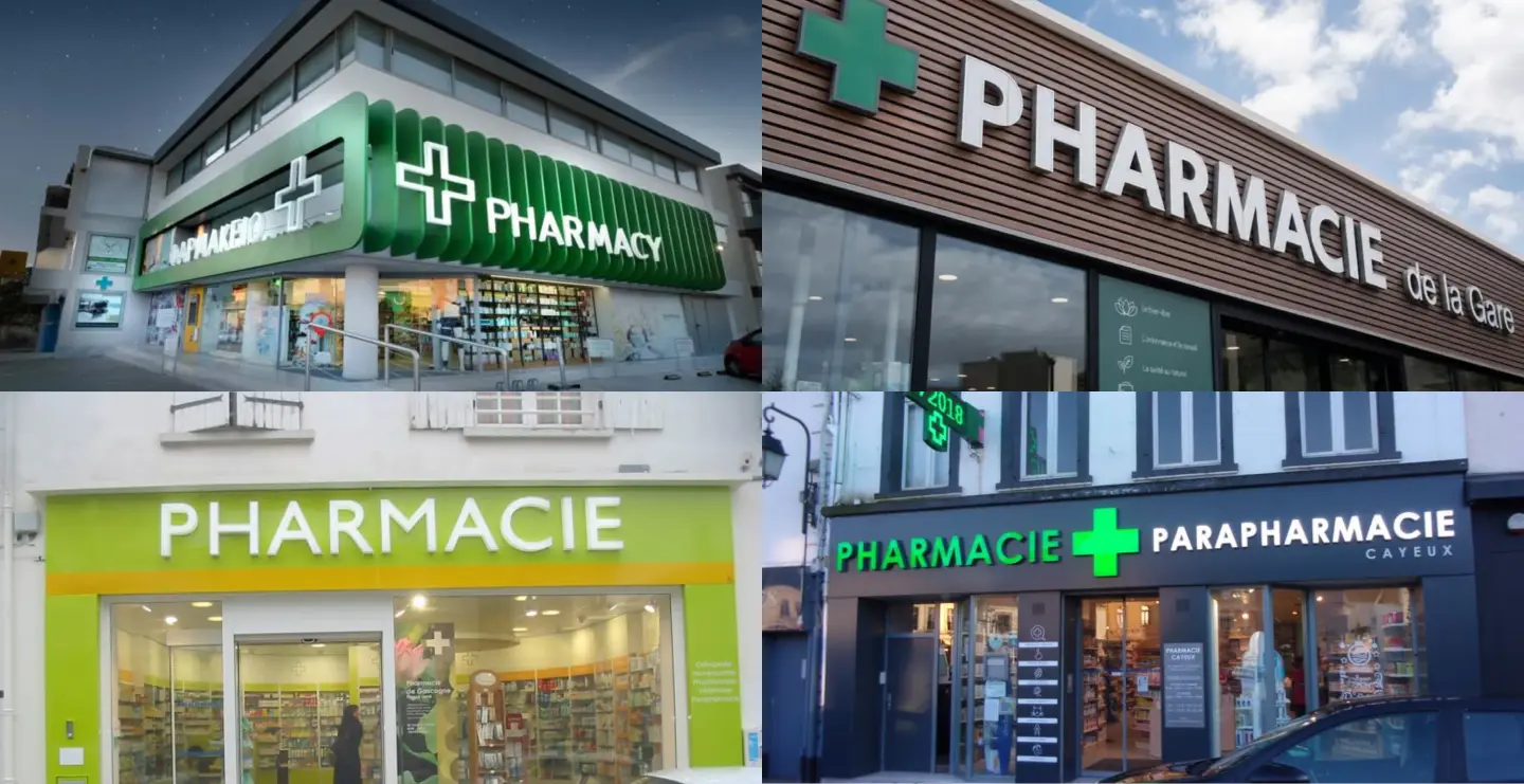
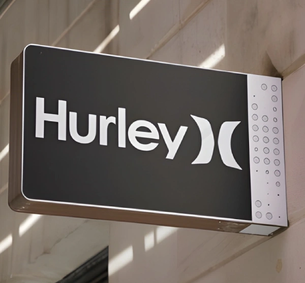
Colour is one of the fastest ways to draw the eye. Bright, high-contrast colour combinations, such as dark backgrounds with light lettering or vice versa, tend to stand out more than muted or overly similar tones. It is worth considering colour psychology too, since warm colours like red and orange often feel energetic and appetising, while blues and greens feel calm and trustworthy.
2. Creative Shapes and Cut-Outs
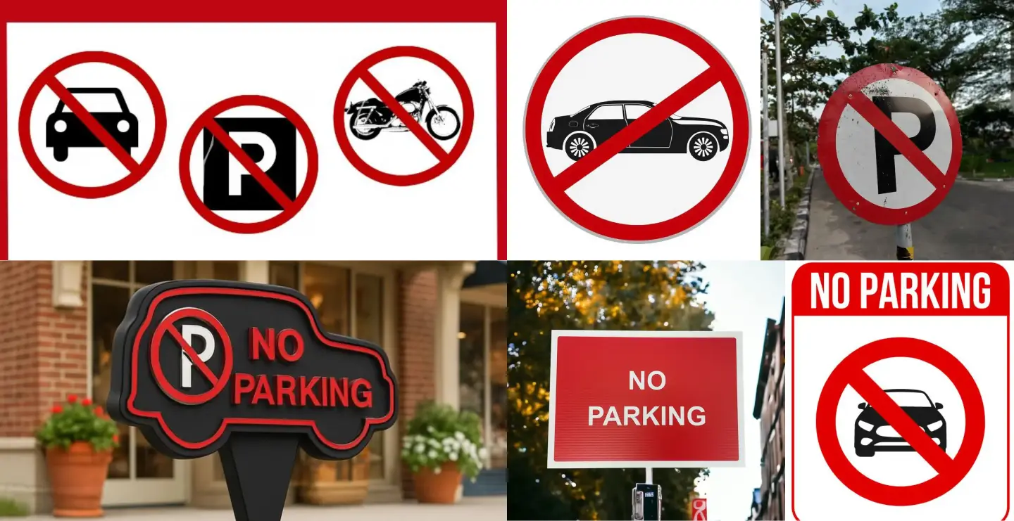
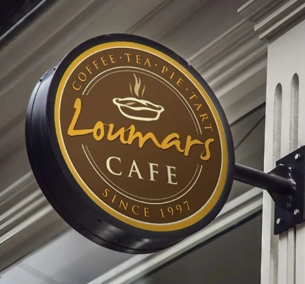
Breaking away from the standard rectangular board with custom-cut shapes, layered panels, or die-cut logos immediately makes a sign more distinctive. A shape that echoes the product or service offered, such as a coffee cup outline for a cafe, adds personality without sacrificing clarity.
3. Typography with Character
While legibility always comes first, choosing a font with some personality, whether bold and modern or elegant and script-style, helps a sign feel intentional rather than generic. Mixing a distinctive display font for the business name with a simple, clean font for supporting text keeps the design attractive without becoming hard to read.
4. Lighting and Movement
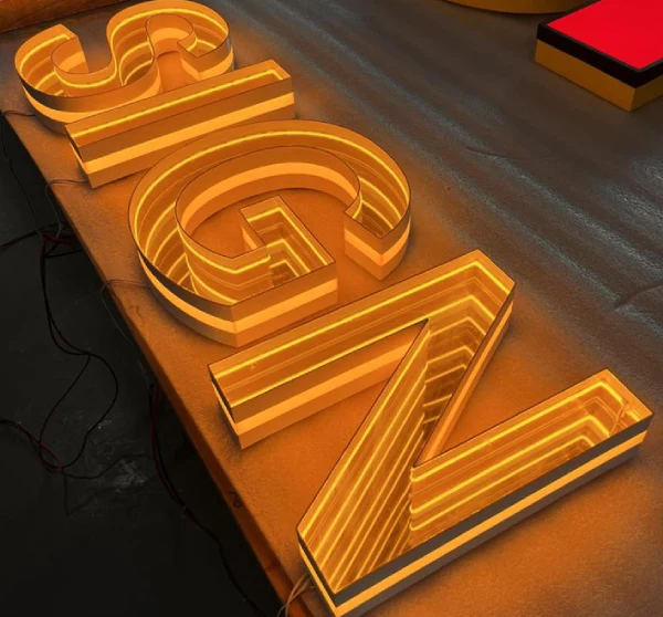
Illuminated signs, whether backlit, edge-lit, or using dynamic LED elements, naturally draw more attention than static, unlit boards, especially in the evening. Subtle movement, such as a rotating element or gently pulsing light, can further increase visibility, though it should be used carefully to avoid looking cluttered or distracting.
5. Texture and Dimension
Flat, single-layer signs can look attractive, but adding texture through raised lettering, layered materials, or a mix of finishes such as matte and gloss creates visual depth that catches the light and draws the eye as people pass by.
Popular Attractive Sign Board Styles


- 3D raised letter signs - dimensional lettering that casts shadows and stands out against the background
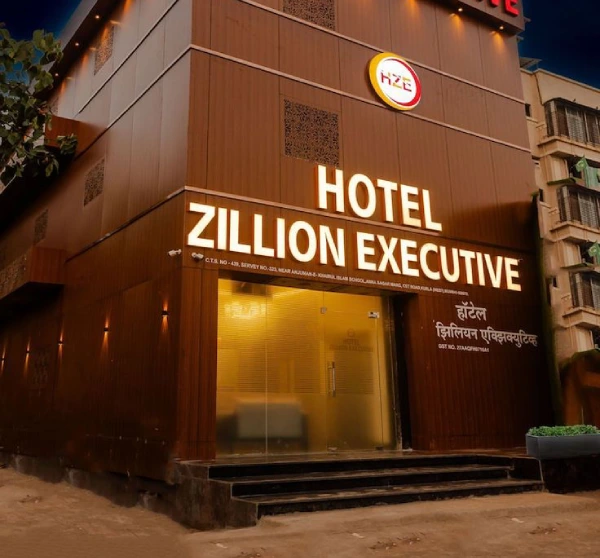
- Backlit and edge-lit signs - illuminated boards that remain eye-catching after dark
- Custom-shaped signs - die-cut boards shaped around a logo, product, or brand icon
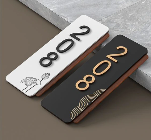
- Mixed-material signs - combinations of wood, metal, and acrylic for a layered, premium look
- Neon-style LED signs - flexible LED neon used for playful, modern branding, especially in cafes and boutiques
Factors to Consider Before Finalising Your Design
- Target audience - design choices should match the taste and expectations of your customer base
- Surrounding visual competition - study nearby signage to ensure yours stands out rather than blending in
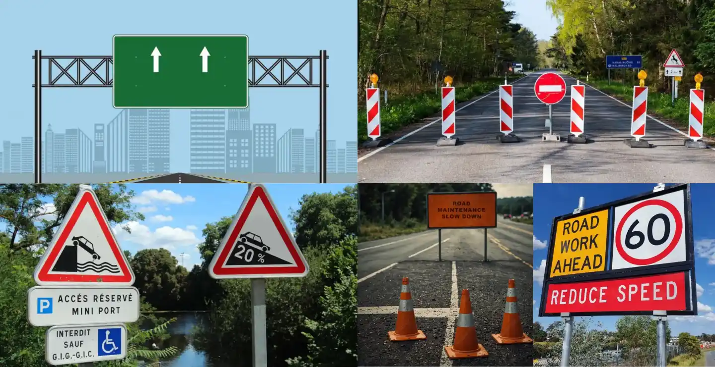
- Viewing distance and speed - keep key information legible even from a distance or a moving vehicle
- Local regulations - some municipalities restrict sign size, brightness, or moving elements
- Budget - prioritise the design elements that offer the most visual impact within your available spend
Attractive Sign Board Price in India (2026)
Pricing depends on size, materials, and how many creative elements such as 3D lettering or illumination are included. Here is a general breakdown to help you plan a budget before requesting a detailed quote.
Raw Material Cost
Base substrate costs typically range from Rs. 50 to Rs. 250 per square foot depending on material. ACP and acrylic sheeting generally fall between Rs. 70 and Rs. 200 per square foot, while premium finishes such as brushed metal can cost more depending on thickness and grade.
Fabricated Sign Board Cost
A simple, flat printed sign with attractive colour and typography typically costs Rs. 400 to Rs. 700 per square foot. Adding 3D lettering, custom shapes, or layered materials generally raises the cost to Rs. 900 to Rs. 1,600 per square foot. Fully illuminated, dimensional signs with LED elements usually range from Rs. 1,300 to Rs. 2,200 per square foot or more.
| Sign Board Type | Approximate Price per Sq. Ft. |
|---|---|
| Simple flat printed sign, fabricated | Rs. 400 - 700 |
| 3D lettering or custom-shaped sign, fabricated | Rs. 900 - 1,600 |
| Illuminated dimensional sign, fabricated | Rs. 1,300 - 2,200+ |
What Affects the Final Price
- Overall size and number of design elements involved
- Whether the sign includes 3D lettering, layering, or custom cut shapes
- Type and extent of illumination, including LED neon or backlighting
- Material combinations such as wood, metal, and acrylic used together
- Installation complexity, especially for large or multi-part signage
These figures are indicative and vary by city, supplier, and design specifics. Always request a detailed quote based on your exact requirements.
Choosing the Right Sign Board Manufacturer
Creative, attractive signage requires a manufacturer who understands both design and fabrication, not just printing. Look for a company that can show a varied portfolio of custom shapes, lighting techniques, and material combinations, and who is willing to collaborate on ideas rather than offering only standard templates. Reputable signage companies guide clients from concept through fabrication and installation to ensure the final board is as functional as it is eye-catching.
Final Thoughts
An attractive sign board is a powerful, low-cost marketing tool that works around the clock to draw customers to your business. By combining bold colour, creative shapes, thoughtful typography, and the right lighting, and by working with an experienced fabricator, you can create signage that genuinely stands out in a crowded street.
Frequently Asked Questions
What makes a sign board more attractive to customers?
A combination of bold contrasting colours, creative shapes, quality materials, and good lighting generally makes a sign board more noticeable and memorable to passersby.
Does lighting really make a sign more attractive?
Yes, illuminated signs remain visible and eye-catching after dark, and lighting effects such as backlighting or LED neon can add a distinctive, modern appeal that static signs lack.
Is a custom-shaped sign more expensive than a standard rectangular one?
Custom shapes generally cost more due to additional cutting and fabrication work, but they often provide a stronger visual impact and better brand differentiation.
How often should an attractive sign board be updated?
Most businesses refresh or replace their signage every 5 to 8 years, or sooner if the design starts to look dated compared to newer branding trends in the area.