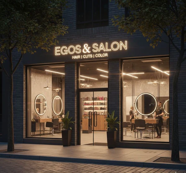
Your sign board is the only salesperson that works 24 hours a day, 365 days a year, without ever asking for a raise. Long before a customer reads your Google reviews, visits your website, or speaks to your staff, your sign board has already delivered its verdict. In India's hyper-competitive commercial landscape, where a single street in Bangalore, Mumbai, or Delhi can host fifty competing brands within a 300-meter stretch, your sign board design is not merely decoration. It is strategic infrastructure.
This guide is built for business owners, marketing directors, architects, and signage professionals who refuse to settle for mediocre. Drawing on design psychology, municipal regulations, material science, and real-world performance data from thousands of installations across India, this is the most comprehensive sign board design resource available in 2026.
1. Why Sign Board Design Is the Most Undervalued Marketing Investment
Most businesses allocate substantial budgets to digital advertising, social media campaigns, and interior fit-outs, yet treat their sign board as an afterthought. This is a fundamental strategic error. Consider the mathematics: a retail store on a busy commercial street in India receives between 15,000 and 60,000 visual impressions daily. A well-designed sign board converts even 0.5% of those impressions into brand awareness. That is 75 to 300 potential customer touchpoints every single day, generated by a one-time investment.
Research from the Sign Research Foundation indicates that updating or installing a new sign board increases business revenue by an average of 4.75%. For a business generating ₹1 crore in annual turnover, this translates to ₹4.75 lakhs in additional revenue from a single capital expenditure. Unlike recurring digital ad spend, a quality sign board delivers compounding returns for a decade or more.
Beyond revenue, sign boards build what marketers call passive brand equity. The customer who passes your sign daily for two years does not consciously decide to trust you. But when they finally need your product or service, your brand is the one they remember. That familiarity is not accidental. It is engineered through consistent, visible, professional sign board design.
2. What Is Sign Board Design? A Precise Definition
Sign board design is the disciplined practice of creating visual communication devices that identify, inform, direct, or promote a business, institution, or space. It encompasses typography selection, color psychology, material specification, lighting engineering, structural mounting, and regulatory compliance.
A sign board is judged by four simultaneous criteria:
- Legibility: Can the message be read quickly and accurately?
- Visibility: Can the sign be seen from the intended distance and angle?
- Memorability: Does the design create a lasting impression?
- Durability: Will the sign maintain its integrity over time?
Failure in any one of these four dimensions undermines the entire investment. A beautiful sign that cannot be read is art, not signage. A legible sign that fades within two years is a recurring expense, not an asset.
3. The Science of Sign Board Visibility: Distance, Height, and Speed
Sign board design is not subjective. It is governed by measurable optical principles. The human eye requires specific minimum letter heights to resolve text at different distances. Ignore these calculations, and your sign fails before it is installed.
Letter Height vs. Viewing Distance
The standard rule used by professional signage engineers is: 1 inch of letter height for every 10 feet of viewing distance. In metric terms, approximately 2.5 centimeters of letter height per 3 meters of viewing distance.
| Viewing Distance | Minimum Letter Height | Typical Application |
|---|---|---|
| 3 meters | 2.5 cm | Indoor reception signs, door nameplates |
| 5 meters | 4 cm | Retail counter signs, office directories |
| 10 meters | 8–10 cm | Shop front signs, pedestrian-facing signage |
| 30 meters | 25–30 cm | Street-facing retail, restaurant exteriors |
| 100 meters | 60–75 cm | Highway signage, pylon signs, mall entrances |
The Speed Factor
A pedestrian walking at normal pace passes a storefront in 3 to 5 seconds. A vehicle traveling at 40 km/h passes a roadside sign in 1.5 seconds. At 60 km/h, that window shrinks to under 1 second. This means your sign must communicate its essential message instantaneously. The human brain processes images 60,000 times faster than text. Therefore, a sign board design must lead with visual identity (logo, color, shape) and support with minimal, high-contrast text.
4. The Seven Non-Negotiable Design Principles
Every high-performing sign board adheres to seven foundational principles. These are not suggestions. They are requirements.
Principle 1: Ruthless Legibility
The primary function of a sign is to be read. Font selection must prioritize clarity over creativity. Sans-serif typefaces such as Helvetica, Montserrat, Futura, and Roboto consistently outperform decorative scripts in legibility studies, particularly at distance and in low-light conditions.
Decorative or script fonts should be reserved for single-word accents or brand names only, and only when the brand identity explicitly demands it. Never use script fonts for addresses, phone numbers, or directional information.
Principle 2: Maximum Contrast
High contrast between text and background is a functional requirement, not an aesthetic preference. The human visual system processes high-contrast combinations (black on white, white on navy, yellow on black) with greater speed and accuracy than low-contrast pairings (beige on white, dark gray on black).
The minimum recommended contrast ratio for signage legibility is 3:1 for large text and 4.5:1 for standard text. When evaluating a design, convert it to grayscale. If the text remains clearly distinguishable, your contrast is sufficient.
Principle 3: The 3-Second Rule
Your sign has 3 seconds to communicate with a pedestrian, and less than 1 second with a motorist. This demands editorial discipline. One primary message only. Business name, yes. Category identifier if not obvious, yes. Everything else is visual noise that dilutes impact and reduces recall.
Principle 4: Absolute Brand Consistency
Your sign board is one touchpoint in a unified brand identity system. Colors must match Pantone, CMYK, or RAL specifications exactly. Fonts must mirror those used in your digital and print materials. Logo placement and proportions must follow brand guidelines. Inconsistency signals amateurism and erodes trust.
Principle 5: Strategic Illumination
In India, commercial activity extends well past sunset. A sign that is invisible after dark loses 50% of its working hours. Illuminated signage is not a luxury for businesses that operate in the evening; it is a performance requirement.
Lighting color also communicates brand personality:
- Warm white (2700K - 3000K): Intimacy, hospitality, food service
- Cool white (4000K - 5000K): Cleanliness, professionalism, healthcare
- Daylight (6000K+): Modernity, technology, precision
- Colored LED/Neon: Personality, energy, entertainment, youth brands
Principle 6: Appropriate Scale
Undersized signs are invisible. Oversized signs appear desperate, crowd the facade, and frequently violate municipal regulations. Optimal scale is determined by viewing distance, mounting surface, surrounding visual clutter, and the brand's desired visual weight in its environment.
Principle 7: Material Integrity
The material of your sign communicates quality before the text is even read. A warped, faded, or corroded sign signals business neglect. Material selection must match the installation environment: outdoor-grade for exterior, premium finishes for luxury interiors, moisture-resistant for coastal locations.
5. Color Psychology in Sign Board Design
Color is not merely decorative. It triggers specific psychological and emotional responses. Strategic color selection can increase sign visibility by up to 40% and improve brand recall significantly.
High-Visibility Color Combinations
- Black on Yellow: Highest visibility combination. Used for caution and high-attention signage.
- White on Blue: Conveys trust, stability, and professionalism. Dominant in banking, healthcare, and corporate sectors.
- White on Red: Urgency, appetite stimulation, and boldness. Common in food retail and sale announcements.
- Black on White or White on Black: Maximum readability, premium positioning, minimalist authority.
- Yellow on Black: Excellent for warning signs and high-contrast outdoor applications.
Industry Color Conventions
While differentiation is valuable, completely ignoring industry color expectations can confuse customers. Healthcare signage typically employs blues, greens, and whites to suggest cleanliness and calm. Food and hospitality leverage reds, oranges, and warm yellows to stimulate appetite. Financial and legal institutions favor navy, forest green, and burgundy to project stability and trust.
6. Typography: The Most Common Point of Failure
Typography mistakes destroy more sign board designs than any other single factor. Here are the rules that professionals follow:
- Font Weight: Outdoor signs require bolder font weights than indoor equivalents. Thin letterforms disappear at distance and in direct sunlight.
- Letter Spacing (Tracking): Slightly increase letter spacing for signs viewed from distance. Tight tracking reduces legibility.
- Case Usage: ALL CAPS reduces reading speed by 10–15%. Use title case or sentence case for body text. Reserve all caps for single-word impact statements only.
- Stroke Width: Letters with extremely thin strokes are invisible from distance. Minimum stroke width for outdoor signage is 1.5 cm for letters under 30 cm height.
- Font Limit: Never use more than two fonts on a single sign. One for the primary message, one for secondary information.
7. Comprehensive Sign Board Types and Applications
LED Sign Boards

LED signage dominates modern commercial applications due to energy efficiency, longevity (50,000+ hours), and visual impact. Sub-types include:
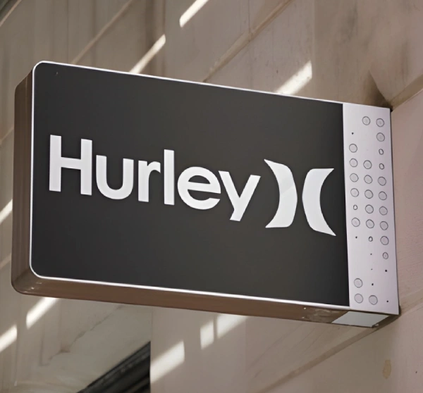
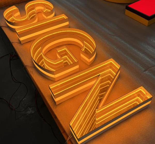
- 3D LED Acrylic Letters: Individual illuminated letters producing halo or front glow. Ideal for storefront branding and corporate reception areas.
- Aluminum Channel Letters: Metal-body letters with internal LED modules. Industrial aesthetic, highly weather-resistant, premium finish.
- Flexible LED Displays: Dynamic boards capable of showing text, images, and video. Perfect for businesses with frequently changing messaging.
- Dot Matrix LED: Grid-based panels for scrolling text. Common in banks, transport hubs, and retail environments.
- Crystal LED Letters: Crystal-encased LEDs creating sparkling, high-end aesthetics. Preferred by luxury brands and boutique hospitality.
- 2D Stencil Cut Acrylic LED: Flat panels with stencil-cut lettering backlit by LED strips. Cost-effective entry into illuminated signage.
Acrylic Sign Boards

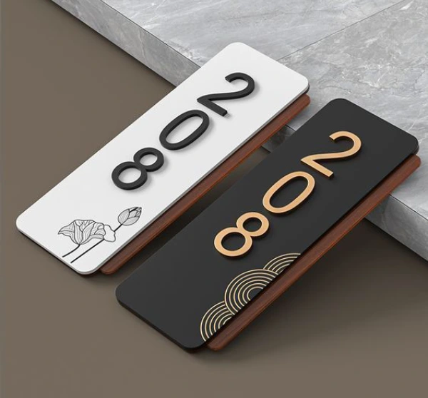
Acrylic (PMMA) is the backbone of indoor corporate and retail branding. Available in dozens of colors, thicknesses (3 mm to 25 mm), and finishes (gloss, matte, frosted, mirror). It accepts UV printing, vinyl application, and laser engraving with excellent results. Standard for office reception boards, directory panels, door signs, and hotel room numbers.
Neon and LED Neon Flex Signs

The neon revival continues into 2026, driven by social media aesthetics and retro-modern design trends. Modern LED neon flex tubing replaces traditional glass neon, offering safety, energy efficiency, and unlimited customization. A well-designed neon sign does not merely identify a business; it becomes a photographic landmark that generates organic social media content daily.
Metal Sign Boards

Stainless steel, aluminum, brass, and corten steel convey permanence and authority. Finishes include hairline (brushed), mirror-polished, sand-blasted, powder-coated, and PVD coating (gold, rose gold, copper effects). Preferred by banks, hospitals, law firms, government institutions, and luxury hotels. Lifespan is measured in decades, not years.
Digital Signage

Digital displays allow instant content changes, scheduled messaging, and live data integration. Formats include commercial displays, touch-screen kiosks, digital standees, video walls, and flat panel displays. Digital signage is not a replacement for static brand identification; it is a complementary dynamic layer.
Pylon and Lollipop Signs

Freestanding structures visible from long distances. Essential for petrol stations, hospitals, shopping malls, hotels, and corporate campuses. Often the first brand touchpoint for businesses located off main roads or within large complexes.
Wayfinding and Safety Signage

Functional signs that guide, protect, and ensure compliance. Includes directional signs, fire safety signs, prohibitory signs, restroom signs, room number signs, and construction safety signs. Often legally mandated and subject to specific design standards.
8. Materials: A Technical Comparison
| Material | Best For | Durability | Cost Range | Key Properties |
|---|---|---|---|---|
| Acrylic (PMMA) | Indoor signs, illuminated letters | 7–10 years indoor | Medium | Lightweight, excellent light transmission, versatile |
| ACP (Aluminum Composite Panel) | Large outdoor faces, fascia boards | 7–10 years outdoor | Low–Medium | Lightweight, rigid, weather-resistant, printable |
| Stainless Steel (304/316) | Premium outdoor letters, name boards | 20–30 years | High | Corrosion-resistant, premium finish, heavy |
| MS Steel (Mild Steel) | Structural frames, cabinet bodies | 10–15 years with coating | Low | Strong, requires protective coating |
| PVC Foam Board | Indoor directional signs, exhibitions | 3–5 years indoor | Very Low | Lightweight, easy to cut, not for outdoor |
| Polycarbonate | Impact-resistant panels, backlit faces | 10–15 years | Medium–High | 250x impact resistance of glass, UV resistant |
| Brass/Bronze | Heritage buildings, luxury hotels | 30+ years | Premium | Develops patina, projects authority and tradition |
| Flex Banner | Temporary banners, event signage | 1–3 years outdoor | Very Low | Cost-effective, large format, temporary |
9. Industry-Specific Sign Board Design Strategies
Retail and Shop Signage
Retail signage must balance brand identity with immediate category communication. A clothing boutique must signal its aesthetic (luxury, fast fashion, ethnic) within the first glance. Bright colors and bold typography drive foot traffic. Window signage, floor graphics, and in-store directional signs are equally critical and often underinvested.
Restaurant and Café Signage
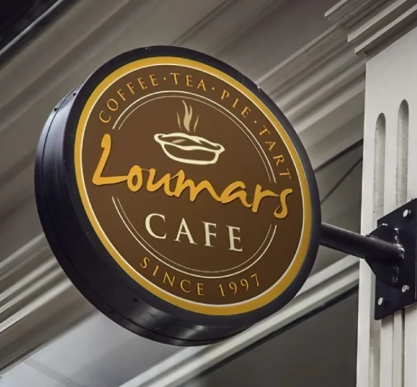
Food businesses live by foot traffic. The sign must communicate ambiance and cuisine style instantly: minimalist monochrome suggests specialty coffee; warm neon signals casual and social; ornate gold lettering signals fine dining. Menu boards—both static and digital—speed up ordering and highlight high-margin items.
Healthcare Signage
Hospital signage serves people who may be stressed, unwell, or disoriented. Clarity and wayfinding supersede aesthetics. Best practices include consistent color-coding for departments, large fonts for older patients, multilingual text, and high-contrast backgrounds. Every sign must reduce cognitive load, not add to it.
Corporate and Office Signage
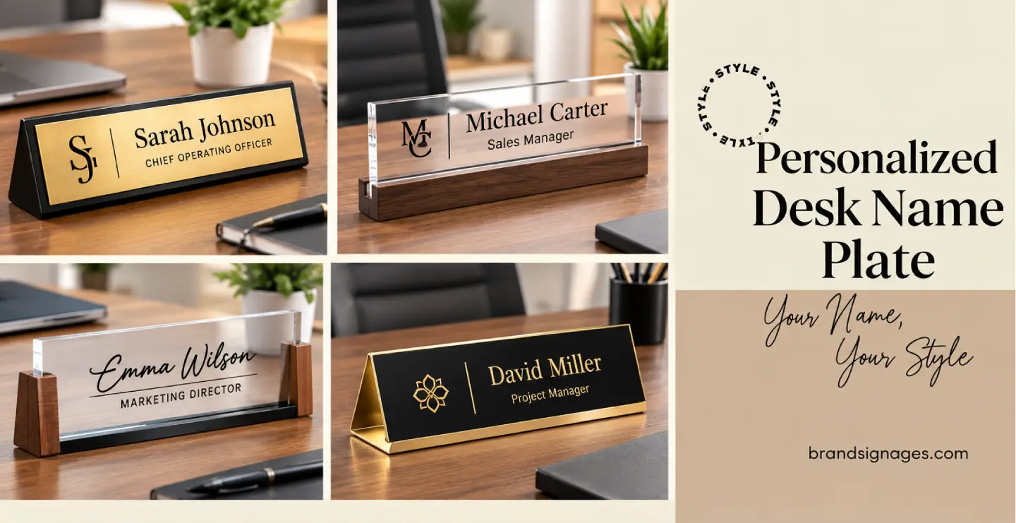
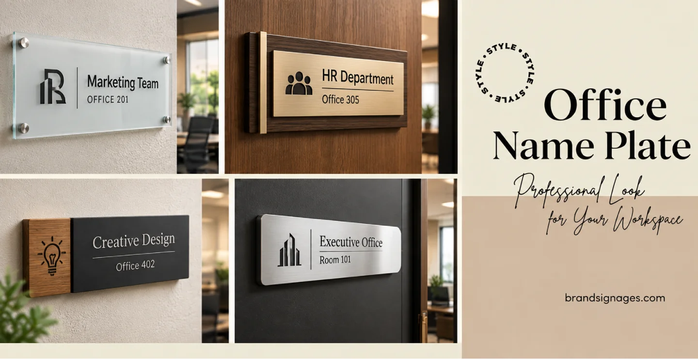
The reception area sign is the first physical brand touchpoint for visiting clients. It must immediately communicate professionalism and values. Corporate signage systems include reception feature walls, desk nameplates, conference room identification, wayfinding, and brand values displays. Consistency across all touchpoints is mandatory.
Hotel and Hospitality Signage
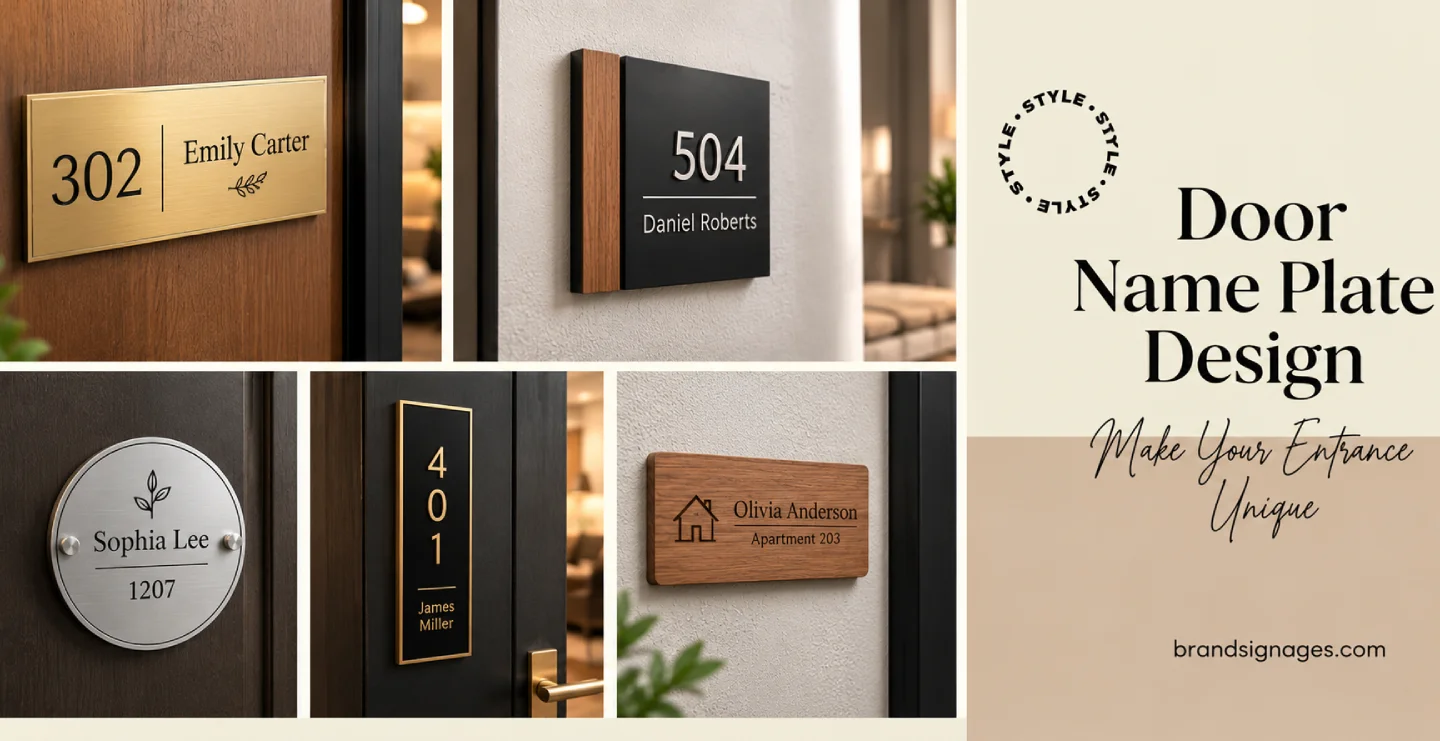
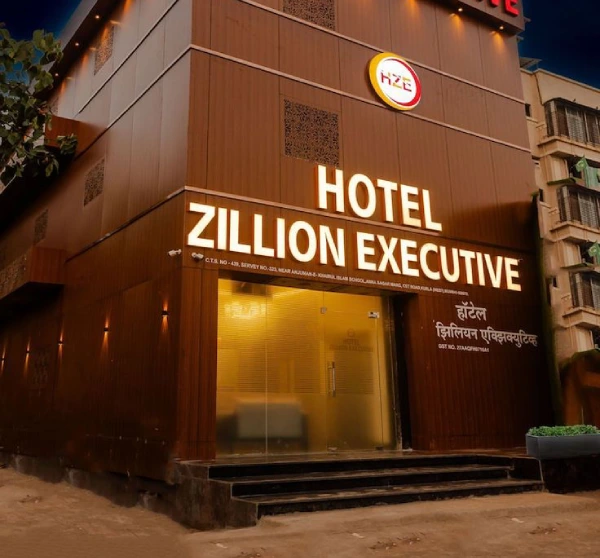
From the porte-cochère sign to room number plates, every piece of hotel signage is a brand expression. Premium properties use brass, polished stainless steel, backlit crystal, and custom-carved stone. Signs must be ADA-compliant and consistent with the property's design language.
Banking and Financial Institutions
Bank signs must project trustworthiness and visibility. Institutional brands rely on meticulously color-accurate signage following strict corporate guidelines. ATM signage, branch identification, and interior directional signs must maintain consistency across hundreds or thousands of locations.
Real Estate and Construction
Real estate hoardings are among the largest and most visually ambitious signs in any city. They must communicate project scale, aspiration, and lifestyle positioning. Construction sites also require legally mandated safety signage that complies with national standards.
10. Sign Board Design Trends Dominating 2026
Halo-Illuminated 3D Lettering
Light spilling behind individual letters to create a glowing silhouette against the wall continues to dominate premium retail and corporate signage. The trend has evolved toward raw metal finishes (brushed steel, matte black, oxidized copper) combined with warm white or amber LED halos for a sophisticated, editorial aesthetic.
Backlit Frosted Acrylic Panels
Frosted acrylic with precision-cut logos, backlit by diffused LED strips, has become the standard for premium corporate reception signage. The frosted surface eliminates hot spots, producing a clean, even glow that signals technological sophistication.
Minimalist Monochrome
A significant counter-trend to traditional Indian commercial maximalism, minimalist monochrome design (black on white, white on black, single material with no lighting) communicates premium confidence. Matte black ACP with engraved white infill is particularly prevalent among DTC and premium brands.
Hybrid Static-Digital Systems
Permanent static brand signs combined with digital display panels for dynamic content represent the best of both worlds: brand permanence with content flexibility. A stone or metal brand sign flanked by a slim commercial display is increasingly common in retail and hospitality.
Biophilic and Sustainable Materials
Environmental responsibility has introduced reclaimed wood, bamboo-faced panels, and moss-wall sign boards into sustainable-brand retail, co-working spaces, and wellness studios. These materials align physical environments with brand values.
Interactive Touch-Screen Kiosks
In high-footfall environments- malls, airports, hospitals, corporate campuses- touch-screen kiosks replace static directories. They offer dynamic wayfinding, self-service information, and integration with booking and payment systems.
11. Indoor vs. Outdoor Sign Board Design: Critical Differences
| Factor | Indoor Signage | Outdoor Signage |
|---|---|---|
| Weather Exposure | None | UV, rain, heat, wind, pollution |
| Brightness Requirements | 300–500 nits (digital) | 2,500–5,000 nits (digital) |
| Material Options | Wide range including delicate finishes | Limited to weather-resistant materials |
| Viewing Distance | 1–5 meters typical | 10–100+ meters typical |
| Font Weight | Regular to bold acceptable | Bold to extra bold required |
| Regulatory Constraints | Minimal (safety standards) | Extensive (municipal bylaws) |
| Maintenance | Low | Regular cleaning and inspection |
12. Sign Board Cost Guide: India 2026
Signage costs vary based on type, size, material, lighting, and manufacturing complexity. The following ranges reflect realistic market pricing for quality workmanship:
- Standard Non-Illuminated Name Boards (Acrylic/ACP): ₹2,000 – ₹15,000
- LED Backlit Acrylic Sign Boards: ₹8,000 – ₹45,000 (standard sizes up to 6 feet)
- 3D LED Acrylic Letter Signs: ₹500 – ₹1,500 per letter
- Metal 3D Letters (Stainless Steel/Aluminum): ₹800 – ₹3,000 per letter
- Neon / LED Neon Flex Signs: ₹5,000 – ₹35,000 (medium format); complex designs exceed ₹1,00,000
- Lollipop / Pylon Sign Boards: ₹25,000 – ₹3,00,000+
- Digital Signage Displays: ₹15,000 – ₹10,00,000+
- Touch Screen Kiosks: ₹50,000 – ₹5,00,000
The cheapest quote rarely represents the best value. Quality materials, professional design, proper installation, and reliable after-sales support determine total cost of ownership. A sign that lasts 15 years is significantly cheaper per annum than one replaced every 3 years.
13. Municipal Regulations and Compliance in India
Outdoor signage in India is governed by local municipal bodies. Non-compliance results in fines, forced removal, or legal complications. Regulations vary by city and zone, so verification before installation is essential.
Key Regulatory Areas
- Permitted Dimensions: Maximum width and height based on road class and building frontage.
- Illumination Rules: Flashing or excessively bright signs may be restricted near residential zones or traffic signals.
- Language Requirements: Cities including Bangalore mandate local language text (Kannada) as a compulsory element, not optional.
- Structural Safety: Large signs and pylons require structural safety certificates from licensed engineers.
- Advertisement Tax: Annual tax for commercial sign boards; non-compliance attracts penalties.
14. The Ten Most Expensive Sign Board Design Mistakes
- Excessive Text: Including address, phone, website, tagline, and product lists creates unreadable clutter. One primary message maximum.
- Decorative Fonts for Body Text: Script fonts are illegible at distance. Use sans-serif for primary communication.
- Insufficient Contrast: Light-on-light or dark-on-dark combinations fail the legibility test. Verify in grayscale.
- Ignoring Night Visibility: A daytime-only sign loses half its effectiveness. Specify illumination and review night simulations.
- Incorrect Scale: Too small looks insignificant; too large violates regulations and overwhelms the facade.
- Brand Inconsistency: Off-color logos or mismatched fonts undermine credibility. Always use approved vector assets.
- Wrong Materials for Environment: Indoor materials on outdoor installations fade, warp, and corrode rapidly.
- No Maintenance Plan: Neglected signs communicate neglected businesses. Schedule annual inspections.
- Ignoring Context: A sign designed in isolation may clash with building color, neighboring signage, or natural lighting.
- Price-Only Procurement: The lowest bid excludes quality, design expertise, and installation professionalism.
15. How to Commission a Sign Board: A Step-by-Step Process
- Define Purpose and Location: Where will it be installed? What is the viewing distance? What is the lighting environment? What must it communicate?
- Audit Brand Assets: Gather vector logo files, Pantone/CMYK/RAL color codes, approved fonts, and brand guidelines.
- Select Sign Type: Match type to purpose, location, budget, and brand aesthetic.
- Calculate Size: Use the 1-inch-per-10-feet rule. Check available mounting surface and municipal size limits.
- Develop Design: Review digital mockups critically. Test legibility, contrast, and brand consistency.
- Specify Materials: Demand a detailed material breakdown. Reputable manufacturers provide this transparently.
- Manufacturing QC: Ensure multi-point inspection for dimensional accuracy, color match, structural integrity, and electrical safety.
- Professional Installation: Improper installation voids warranties, creates hazards, and degrades appearance.
16. Choosing the Right Signage Partner
Not all signage manufacturers deliver equal value. Evaluate potential partners on these criteria:
- Portfolio Depth: Do they have experience across multiple industries and sign types?
- Design Capability: Do they offer professional design services or merely execute your files?
- Material Transparency: Will they specify exactly what materials and LEDs they use?
- Installation Expertise: Do they handle installation with trained teams, or outsource to unskilled labor?
- Regulatory Knowledge: Can they navigate local municipal requirements?
- After-Sales Support: Is maintenance, repair, and LED replacement available?
- Multi-Location Capability: For chain businesses, can they deliver consistent quality across cities?
17. The Future of Sign Board Design
The signage industry is converging with digital technology, sustainability mandates, and experiential design. Smart signage with IoT integration, solar-powered illumination, and AI-driven content optimization are not distant futures; they are entering the market now. Businesses that treat sign board design as a dynamic, evolving discipline rather than a one-time purchase will maintain competitive advantage.
However, technology does not replace fundamentals. The sign boards that will perform best in 2026 and beyond will be those that combine timeless design principles- legibility, contrast, brand consistency, and material quality—with selective adoption of new capabilities.
Conclusion: Your Sign Board Is Your Silent Brand Ambassador
In the time it has taken to read this guide, thousands of potential customers have walked, driven, or ridden past commercial signage. Some signs captured their attention, built familiarity, and planted the seed of future business. Others were invisible, forgettable, or worse, communicated neglect and amateurism.
The difference is never the product or service behind the sign. It is the quality of thinking, design, materials, and craftsmanship that went into the sign itself. A well-designed sign board works continuously without recurring cost. It builds recognition, attracts customers, guides visitors, and communicates quality before any transaction occurs.
Sign board design is not an expense. It is an investment with measurable returns. Treat it with the strategic importance it deserves, and it will reward your business for years to come.