When someone enters your office, their first real interaction with your brand happens in the reception area. And right at the center of that moment is your office reception signage, the visual touchpoint that sets expectations, builds trust, and tells visitors exactly who you are before a single word is spoken.
A reception signage board is more than a nameplate. It’s a visual handshake. It communicates credibility, identity, and the personality of your workplace. Whether you manage a corporate office, hospital, law firm, startup, salon, or co-working space, your reception signage silently shapes how people perceive your brand.
A thoughtfully designed reception area and office name board can turn a first impression into a lasting one. Comfortable seating, a warm ambiance, and friendly staff all matter but clear, aesthetically pleasing signage ensures visitors feel welcomed, informed, and confident the moment they step in.
Why High-Quality Reception Signage Matters
Great reception signage goes far beyond looking good on a wall. It influences how people think, feel, and remember your brand. It improves communication, elevates professionalism, and ensures your space feels intentional and cohesive.

Here’s why it should be a core part of your workplace design:
1. Clearly Communicates Important Information
Visitors should never have to guess where to go or what to do.
A well-designed reception signage board quickly communicates things like:
- Where to check in
- Visitor pass requirements
- Operating hours
- Department directions
- Service highlights
This reduces confusion and helps your front-desk team work more efficiently.
2. Makes Navigation Effortless
Reception signs often double as wayfinding tools. When visitors can easily locate meeting rooms, departments, elevators, or restrooms, the experience becomes smoother, and more professional.
Clear directories, arrows, and floor maps ensure no one feels lost, especially first-time visitors.
3. Creates a Warm, Welcoming Atmosphere
Spaces without visual identity feel cold and generic.
Reception signage adds personality and warmth.
Whether it’s:
- A simple welcome message
- Backlit logo signage
- A modern acrylic panel
- A design inspired by your industry
The right signage helps visitors feel comfortable and engaged.
4. Enhances the Look and Feel of Your Space
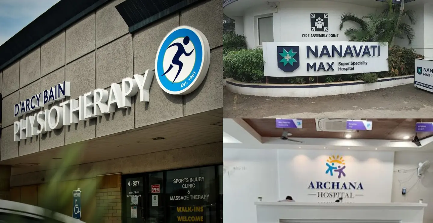
Signage is a design element. It fills empty walls, elevates the aesthetic, and makes your space look curated and professional. This is especially useful in offices like clinics, consulting firms, and legal practices where calm, well-designed environments matter.
5. Strengthens Brand Identity
People remember what they see.
Your reception signage reinforces:
- Brand recall
- Trust
- Professional image
Logos, taglines, mission statements, and brand colours displayed visually make your identity memorable.
6. Boosts Employee Pride and Culture
Employees pass by your reception every day. A strong, visually consistent identity at the entrance reinforces company culture and pride, giving teams a stronger sense of belonging.
7. Enables Quick and Professional Updates
Temporary or changeable signage helps you update messages without compromising aesthetics.
Options include:
- Acrylic insert frames
- Snap frames
- Digital screens
- Printed foam-board panels
These allow you to announce events, policies, or seasonal updates easily.
8. Supports Accessibility and Compliance
Reception signage must also align with accessibility guidelines under the RPWD Act, 2016.
This includes:
- High-contrast colours
- Clear typography
- Proper height placement
- Tactile or braille options where required
Accessible signage ensures every visitor feels respected and supported.
Office Reception Signage Design Ideas for 2026


Types of Office Reception Signage (Material Options)
Reception signage isn’t one-size-fits-all. Your choice depends on brand personality, budget, and the environment.
Here are the most popular options:
1. Acrylic Signage
Modern, clean, and highly customizable.
Best for: Startups, tech companies, creative agencies
Benefits: Lightweight, durable, premium look
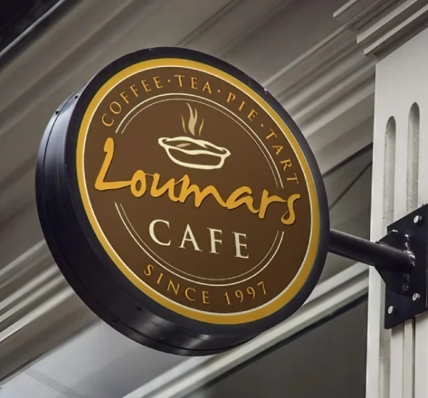
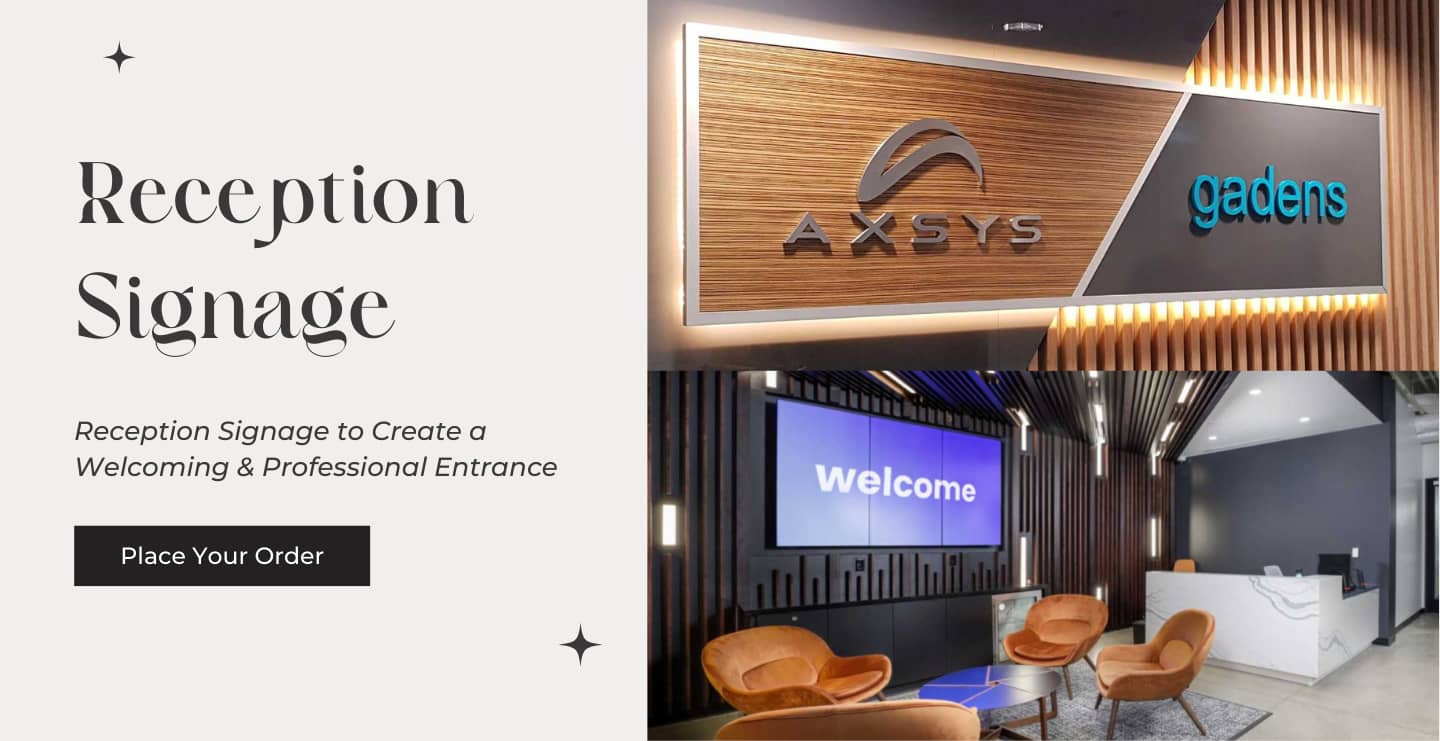
2. Metal Signage
Elegant, timeless, and extremely durable.
Best for: Law firms, hotels, luxury brands
Benefits: Premium finish, long-lasting and sophisticated
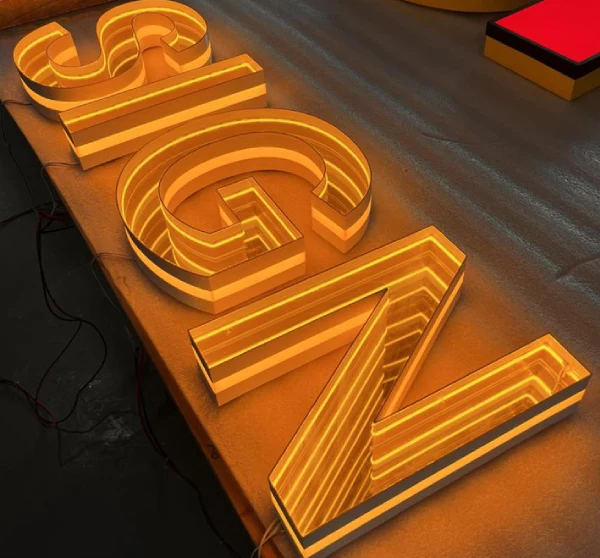
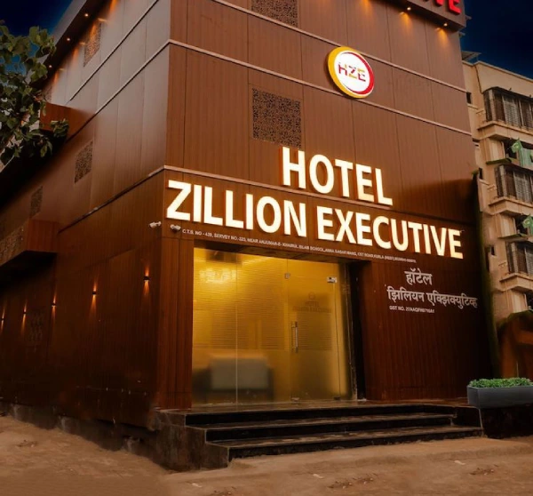
3. LED-Lit Signage
Illuminated signage creates a premium, high-impact effect.
Styles include:
- Front-lit
- Back-lit (halo effect)
- Edge-lit
- Neon-style LED
Popular in modern offices and premium brand spaces.
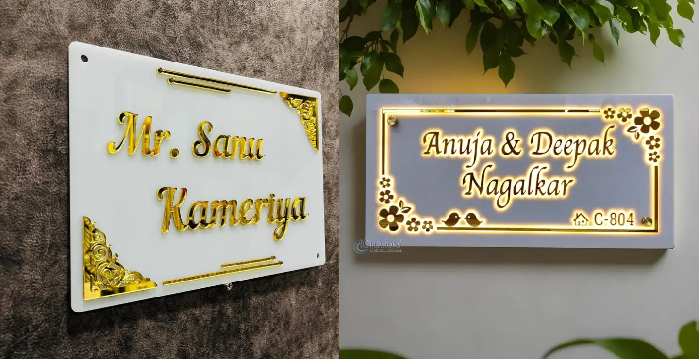
4. Wooden Signage
Warm, natural, and inviting.
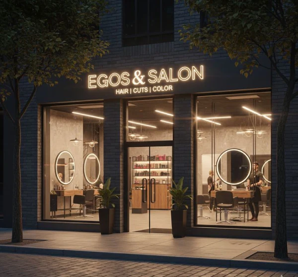
Best for: Wellness brands, salons, spas, eco-friendly businesses
Benefits: Unique textures, natural warmth, custom engraving
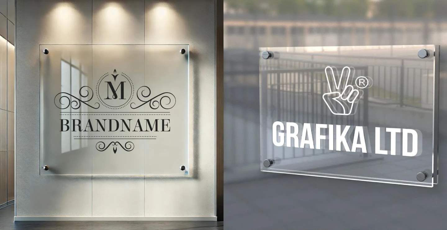
5. Glass Signage
Minimalist and polished.
Best for: Corporate offices, clinics, premium workspaces
Benefits: Sleek, easy to clean, elegant transparency
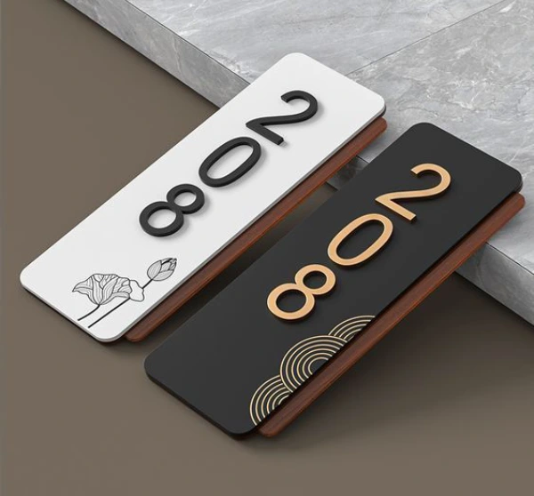
6. 3D Letter Signage
Bold and dimensional, installed directly onto the reception wall.
Material options include:
- Metal
- Acrylic
- Foam
- MDF
- LED neon letters
Great for brands that want instant visual impact.
How to Choose the Right Reception Signage
Your signage should fit your space and reflect your brand’s personality. Here’s what to consider:
1. Budget
- Costs vary based on materials, lighting, and scale.
- Even simple acrylic signage can look premium when designed well.
2. Brand Alignment
Your signage should feel like your brand, even before reading the name.
Examples:
- Modern brands → bold colours, LED effects
- Corporate firms → metal letters, minimalist style
- Wellness brands → warm tones, wood textures
3. Purpose of the Sign
Different signs serve different functions:
- Branding signs: Create identity
- Information signs: Share instructions
- Wayfinding signs: Guide movement
Match design with purpose, bold for branding, clean for clarity.
4. Placement & Visibility
The right placement boosts visibility and impact.
Ask:
- What’s the first wall visitors naturally look at?
- Will the sign be visible from the entrance?
- Do lights enhance or overshadow the signage?
Reception walls, entry pathways, and behind the desk are ideal spots.
Design Elements That Matter
Getting the design right makes your signage truly stand out.
1. Size & Proportion
Too small → unnoticed
Too large → overwhelming
Choose a size based on wall dimensions and viewing distance.
2. Typography
Select fonts that are:
- Clean
- Readable
- Brand-consistent
Avoid overly decorative fonts unless they suit your identity.
3. Colour Palette
Color psychology impacts perception:
- Blue → trust
- Black → elegance
- Gold → luxury
- White → minimal
- Green → calm
- Red → energy
Choose what aligns with your brand’s personality.
4. Lighting
Lighting transforms signage visibility and mood.
Options include:
- Backlit glow
- Front illumination
- Spotlights
- Ambient light blending
The right lighting can make even simple signage look premium.
Start Your Reception Signage Project with Us
A well-designed reception signage board is more than decoration, it’s a strategic tool that communicates your brand identity, professionalism, and values from the very first moment a visitor steps in.
By choosing the right material, typography, lighting, and placement, businesses can create a reception space that is welcoming, navigable, and memorable. Thoughtful office signage enhances first impressions, strengthens brand recall, supports wayfinding, and even reinforces employee pride.
In essence, your reception signage sets the tone for every interaction that follows. Investing in design, clarity, and quality ensures that your office leaves a lasting impression- one that reflects who you are as a brand and how seriously you take your workspace experience.