Effective sign board design serves as a powerful tool in visual communication and outdoor advertising, helping businesses across retail, hospitality, services, and other sectors stand out in competitive environments.
Well-crafted signage solutions enhance brand visibility, reinforce brand identity, and create a strong first impression that influences consumer behavior. As a silent marketing tool, an impactful sign attracts customers, drives foot traffic, and supports business growth by communicating messages clearly and memorably.
A successful sign balances aesthetic appeal through harmonious colors, typography, and graphics with functional excellence, prioritizing legibility, simplicity, visibility from a distance, and quick comprehension to guide or persuade viewers effectively.
Core Principles of Impactful Sign Board Design
Mastering design best practices ensures your sign delivers maximum readability, legibility, and clarity while minimizing cognitive load. By establishing strong visual hierarchy, prioritizing the core message, and incorporating a clear call to action, effective signage creates an intuitive user experience that captures attention instantly and drives results.
Here are the foundational principles:
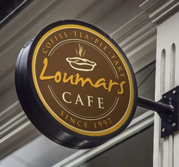
Clarity and Conciseness: The Golden Rules
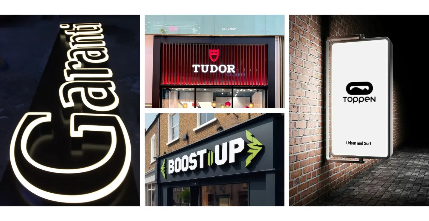
Great signs follow the rule of instant comprehension, viewers should grasp the message in 3-5 seconds or less. Use brief messaging and direct communication focused only on essential information. Avoid clutter by embracing minimalist design and ruthlessly editing text. This respects short attention spans and ensures the core message stands out clearly and memorably.
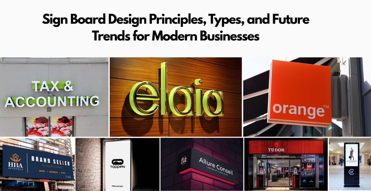
Here are examples of clear, minimalist designs with strong visual hierarchy:

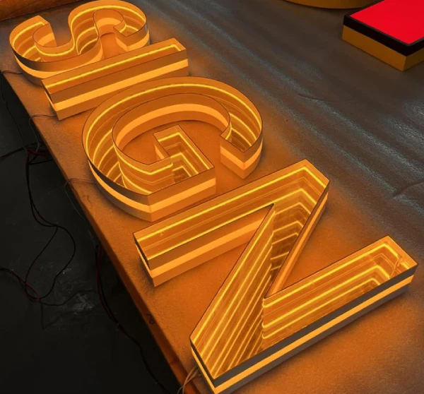
The Power of Visibility and Impact
To achieve high visibility and become truly attention-grabbing, prioritize contrast between text and background, large bold fonts, and appropriate sizing based on viewing distance. Strategic placement at eye level along foot traffic or vehicle traffic paths is essential. Incorporate lighting strategies (e.g., illuminated or reflective materials) and account for environmental considerations like weather and time of day to boost audience engagement and overall impact.
These bold, high-contrast examples demonstrate maximum outdoor visibility:

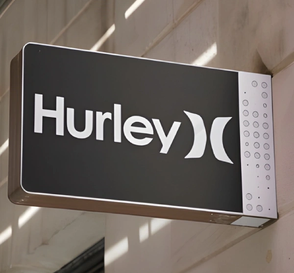
Branding Consistency in Signage
Adhering to brand guidelines across all signage reinforces corporate identity and builds brand recognition. Use the approved logo usage, color palette, typography, and consistent messaging to create a cohesive brand experience. This uniformity enhances trustworthiness, strengthens brand perception, and makes your business instantly recognizable—even from a distance. Inconsistent branding dilutes impact and confuses customers.
See how consistent branding creates a unified, professional look:

Strategic Use of White Space
Negative space (or white space) provides visual breathing room, dramatically reducing clutter and improving focus on key elements. This technique enhances readability, creates design balance, and adds sophisticated aesthetic appeal through visual separation. By giving text and graphics room to “breathe,” signs feel more premium, modern, and easier to process—turning good designs into exceptional ones.
These elegant examples showcase the power of negative space:

Mastering Visual Elements in Signage
Effective visual communication relies on mastering core design elements typography, color, and graphics to create compelling visuals that boost engagement and leave a lasting impression. Thoughtful graphic design and aesthetic considerations transform ordinary signs into powerful tools for signage aesthetics and customer connection.
Sign Board Typography: Choosing the Best Fonts for Impact
Font selection and typography is crucial for legibility and readability at a distance. Opt for bold sans-serif typefaces (e.g., Helvetica, Arial Black, or Impact) with thick stroke width, large x-height, and generous character spacing they perform best outdoors and from afar. Avoid thin serif or overly decorative fonts that lose clarity. Create a clear hierarchy of text with varying sizes and weights, and always test font psychology bold sans-serifs convey modernity and strength.
These examples showcase clean, bold sans-serif typography optimized for maximum readability:

Color Psychology: How to Choose Colors for Sign Boards
Color theory guides emotional responses: red evokes urgency and excitement (perfect for sales/restaurants), blue builds trust and calmness (ideal for banks/healthcare), while yellow grabs attention with energy. Maximize contrast and visibility with complementary schemes, stick to brand colors, and consider cultural considerations. Use high-contrast combinations (e.g., white on black) for legibility, and incorporate primary colors or safety colors where needed to align with brand messaging and evoke the right feelings.
Red drives urgency in these attention-grabbing signs:

Engaging Graphics and Imagery for Sign Boards
Incorporate high-resolution graphics, logos, and relevant imagery to support visual storytelling and heighten visual appeal. Use vector graphics for scalability without quality loss, place key brand assets prominently, and ensure image placement complements rather than overwhelms text. Quality iconography adds instant recognition and graphic impact, making signs more memorable and emotionally resonant. Keep elements simple and relevant to avoid clutter.
These modern designs integrate strong graphics, logos, and typography seamlessly:

Exploring Types of Sign Boards & Their Applications
Commercial signage encompasses a wide range of business signs, from outdoor signs to indoor signs, each tailored for specific applications in retail signage, corporate signage, informational signs, promotional signs, and custom signs. Choosing the right type enhances visibility, guides customers, and aligns with communication goals across diverse environments.
Outdoor Signage: Maximizing Exterior Presence
Exterior signs like pylon signs, monument signs, building mounted signs, pole signs, sidewalk signs, and A-frame signs demand weather resistance, durability, and high visibility. Use bold fonts, strong contrast, and illumination for 24/7 street presence. Ideal for highways, storefronts, or campuses, they withstand elements while grabbing attention from vehicle traffic and pedestrians, boosting overall brand exposure.
These striking acrylic LED and metal sign examples showcase durable outdoor designs:

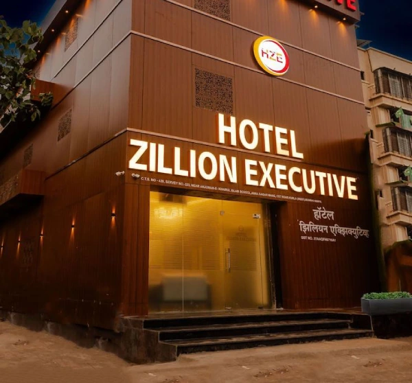
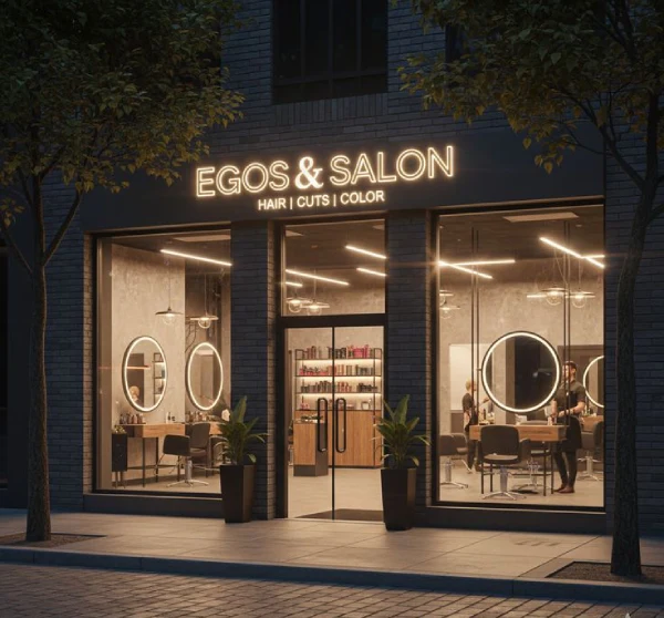
Storefront Signs: Attracting Customers at First Glance
Storefront signs including fascia signs, illuminated channel letters, window graphics, and entry point signage—create instant customer attraction and strong retail presence. Prioritize bold, backlit or halo-lit letters for nighttime visibility, consistent branding, and clear messaging at eye level. These point-of-sale signage solutions draw foot traffic, reinforce brand display, and convert passersby into customers with eye-catching design.
Illuminated channel letters deliver premium storefront impact:

Digital & LED Signage: Dynamic Visual Communication
LED signs, digital screens, and electronic message boards offer unmatched flexibility with dynamic content, real-time updates, animations, and programmable signs. Use content management systems for promotions, menus, or announcements. Their bright, eye-catching nature excels in high-traffic areas, providing video walls or scrolling messages that adapt instantly perfect for modern retail, events, or corporate lobbies seeking high engagement.
Digital signage bring movement and modernity:

Wayfinding & Directional Signs: Guiding the Path
Directional signage ensures smooth navigation and pedestrian flow using clear directional arrows, universal symbols, informational maps, and consistent styling. For interior wayfinding in malls/offices or exterior wayfinding on campuses/hospitals, prioritize simplicity, high contrast, and logical hierarchy to reduce confusion. Effective wayfinding improves user experience, accessibility, and efficiency in complex spaces.
This intuitive wayfinding systems guide visitors effortlessly:

Choosing the Right Materials for Your Sign Board
Selecting the appropriate signage materials is key to balancing durability, longevity, weather resistance, cost-effectiveness, and sustainability. The right substrate ensures your sign withstands its environment while delivering optimal performance through smart material selection and fabrication techniques.
Durable Materials for Outdoor Sign Boards
For harsh outdoor conditions, prioritize materials with excellent UV resistance, weather-proof qualities, and impact resistance. Aluminum composite panel (ACP) offers superior rigidity, lightweight strength, and long-term longevity with minimal maintenance. Acrylic excels in crystal-clear, illuminated applications. PVC and corrugated plastic provide affordable, lightweight options for temporary use, while metal (e.g., aluminum) and treated wood deliver premium durability. Vinyl overlays add vibrant graphics to any substrate.
Premium ACP panels create sleek, weather-resistant outdoor signage

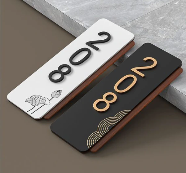
Indoor Signage Materials & Their Benefits
Indoor environments favor materials that prioritize aesthetics, ease of handling, and versatility. Foam board is lightweight, affordable, and perfect for temporary signs or retail displays. Cardstock and fabric banners offer flexible, cost-effective options for hanging or mounted graphics. Brushed metal and glass provide a sophisticated, modern look for office signs and permanent fixtures, enhancing interior design. These materials install easily, require low maintenance, and support vibrant, high-quality printing for professional results.
Brushed metal and acrylic add elegance to office signage:

Avoiding Common Sign Board Design Mistakes
Even experienced designers fall into traps that turn effective signage into ineffective signage. Recognizing these design errors and design flaws like visual clutter, illegibility, poor contrast, wrong font choice, misplaced signs, outdated design, or legal non-compliance helps create signs that truly work. Avoiding bad design pitfalls saves time, money, and boosts impact.
Common mistakes include cramming too much text (overwhelming viewers), low contrast making text invisible from distance, fancy/decorative fonts sacrificing readability, ignoring viewing distance/placement, and inconsistent or outdated branding. Always prioritize simplicity, test legibility in real conditions, and follow accessibility guidelines to prevent these issues.
These cluttered, text-heavy examples show classic visual clutter and illegibility problems:

The Future of Signage: Emerging Technologies & Trends
The signage industry is undergoing rapid digital transformation, driven by innovation and next-generation signage that enhance visual communication. Future trends include AI integration, interactive experiences, and sustainable practices, revolutionizing how businesses engage audiences and deliver messages in 2026 and beyond.
AI-Driven Signage: Revolutionizing Design and Engagement
Artificial intelligence in signage is transforming static displays into intelligent systems. Predictive analytics and machine learning enable personalized content delivery, adapting messages in real-time based on viewer demographics, time, or behavior via audience recognition and sensors. Data-driven design automates content creation, optimizes scheduling, and boosts engagement while preventing downtime through predictive maintenance. This shift creates hyper-relevant experiences that feel intuitive and highly effective.
Interactive Signs: Engaging Audiences in New Ways
Interactive signage elevates user experience (UX) through touch screen displays, QR codes, augmented reality (AR) signage, motion sensors, and gesture control. These tools enable real-time feedback, immersive storytelling, and experiential marketing customers can explore products, access info, or play games directly. Key considerations include intuitive interfaces, fast response times, and accessibility to maximize engagement and turn passive viewers into active participants. (84 words)
Engaging touch screen interactive retail signage draws in customers:

Latest Technology & Sustainability in Sign Board Design
Beyond AI and interactivity, IoT signage integrates smart sensors for real-time data, automated adjustments, and energy management. Energy-efficient lighting (like advanced LEDs) reduces consumption significantly. Sustainability gains traction with eco-friendly materials, recycled content, biodegradable substrates, and green signage practices that prioritize resource efficiency and lower environmental impact aligning with consumer values and regulations for long-term viability.
How to Choose a Sign Board Design Company
Selecting the right sign board manufacturers, custom sign makers, signage board design or signage services provider is crucial for creating impactful, durable signs that align with your brand and budget. A strong partnership with reputable companies or design agencies ensures professional results, timely delivery, and long-term value.
Key criteria for vendor selection include:
- Portfolio review- Examine their previous work for quality, creativity, and relevance to your industry.
- Client testimonials and reviews- Look for consistent positive feedback on communication, installation, and durability.
- Experience in custom signs and materials suited to your environment (indoor/outdoor).
- Clear budgeting transparency, including quotes for design, fabrication, and installation.
- Strong consultation process- They should listen to your needs, offer expert advice, and provide mockups.
Discuss Your Queries with Top Signage Experts
Contact Us →Ask these essential questions:
- What is your turnaround time and warranty policy?
- Do you handle permitting and installation?
- Can you provide references from similar projects?
Consider local sign companies for faster service and easier site visits, but compare multiple options.
For exceptional custom signages, consider purchasing from Brand Signages, known for modern office name boards, innovative designs, and high-quality execution that blends aesthetics with functionality.
Sign Board Design- FAQs
1. What is effective sign board design?
Effective sign board design combines visual appeal, clarity, and functionality to communicate messages quickly and memorably. It prioritizes readability from various distances, uses strategic colors and fonts, incorporates branding elements, and avoids clutter. A successful sign grabs attention in 3-5 seconds, guides actions, and aligns with the business's identity, enhancing customer attraction and overall marketing impact.
2. Why is good sign board design important for businesses?
Good sign board design boosts brand visibility, creates strong first impressions, and drives customer engagement. In competitive sectors like retail and hospitality, it attracts foot traffic, reinforces identity, and influences consumer behavior. Poor designs can confuse or repel potential customers, while effective ones support business growth by serving as silent salespeople, increasing sales, and fostering trust.
3. What are the fundamental principles of good sign board design?
Key principles include clarity (brief messaging), legibility (bold fonts and contrast), visual hierarchy (prioritizing key info), simplicity (minimal elements), and a clear call to action. Balance aesthetics with functionality, ensuring quick comprehension while minimizing cognitive load. Incorporate branding consistency and test for real-world visibility to create intuitive, engaging user experiences.
4. How can I make my sign board more visible and impactful?
Enhance visibility with high contrast, large fonts, strategic lighting (e.g., LED backlighting), and optimal placement along traffic paths. Consider viewing distance, environmental factors like weather, and bold colors. For impact, add dynamic elements like motion or illumination, and test in actual conditions to ensure it stands out and engages audiences effectively.
5. Why is branding consistency important for my signs?
Branding consistency builds recognition, trust, and a cohesive identity across all touchpoints. Uniform logos, colors, fonts, and messaging make your business memorable and professional, strengthening perception and loyalty. Inconsistencies confuse customers and dilute impact, while aligned signage reinforces reliability and differentiates you in crowded markets.
6. What role does white space play in effective sign design?
White space (negative space) provides visual breathing room, reducing clutter and improving focus on key elements. It enhances readability, balance, and aesthetic appeal, making signs feel premium and easier to process. Strategic use separates content, guides the eye, and prevents overwhelm, turning busy designs into elegant, impactful ones.
7. How do I choose the right fonts for my sign board?
Select bold, sans-serif fonts (e.g., Helvetica or Arial) for legibility at distances, with thick strokes and ample spacing. Avoid decorative or serif styles that blur. Consider font psychology modern sans-serifs convey strength. Establish hierarchy with varying sizes/weights, and test for clarity in context.
8. What are the main types of sign boards available?
Main types include outdoor (pylons, monuments), storefront (fascia, illuminated), digital/LED (dynamic displays), and wayfinding (directional). Others: indoor (foam boards, banners), promotional (A-frames), and custom. Each suits specific applications, from retail attraction to navigation in complexes.
9. What are the most common mistakes people make when designing sign boards?
Common pitfalls: overcrowding text (clutter), poor contrast (illegibility), wrong fonts (decorative over readable), ignoring distance/placement, inconsistent branding, and outdated elements. Always test for clarity and avoid legal non-compliance like size restrictions.
10. What are the biggest future trends in sign board design?
In 2026, trends include AI personalization, programmatic DOOH, retail media growth, e-paper for efficiency, hyper-personalization, 3D/digital integration, sustainable materials, inclusive focused design, imperfect/human-centered aesthetics, and smarter surfaces with AV-over-IP. Expect warmer, flexible styles emphasizing authenticity and eco-friendliness.