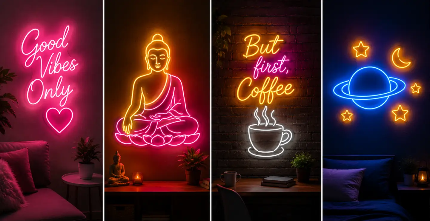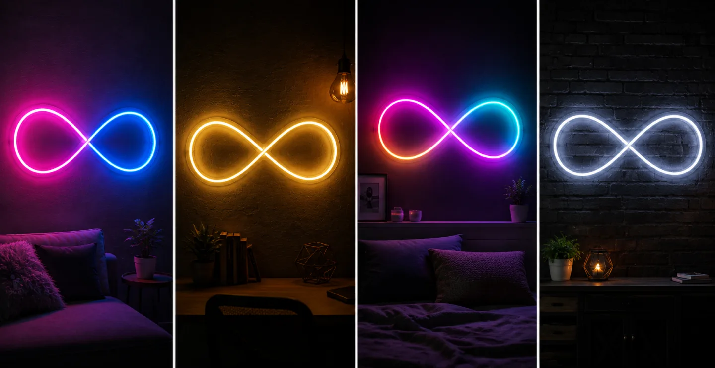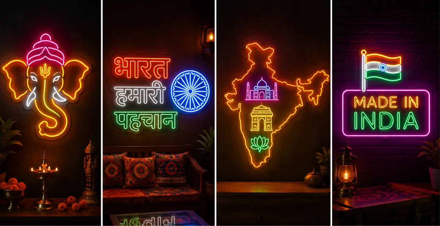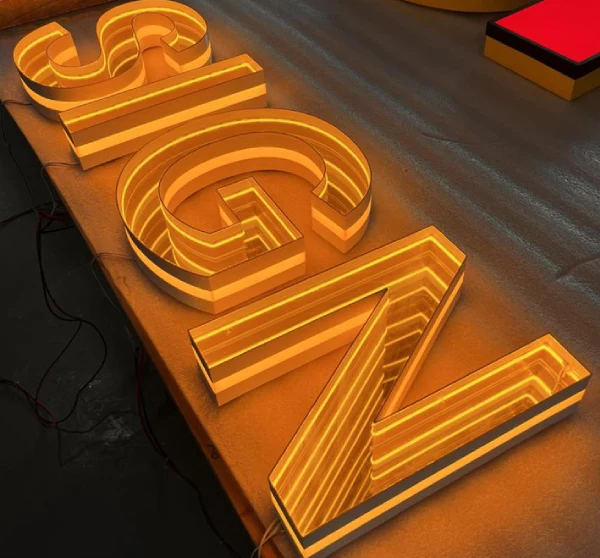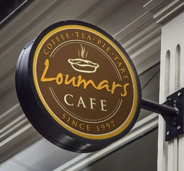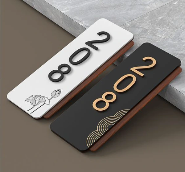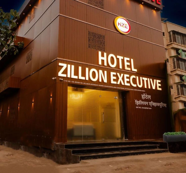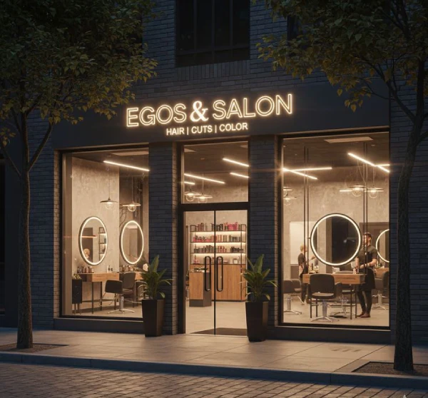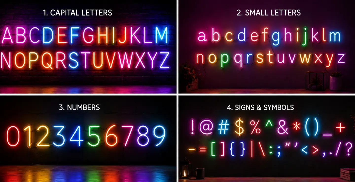
A neon sign font can completely change the appearance, personality, and visibility of a custom neon sign. Whether you are creating a sign for a restaurant, café, retail store, office, bedroom, wedding, event, salon, or home, choosing the right font is an important part of the design process. A good font should not only look attractive but also remain clear and readable when illuminated.
Today, LED neon signs are widely used as decorative and promotional displays because they offer bright illumination, flexible designs, and many customization options. Customers can choose from script, cursive, handwritten, bold, modern, retro, and minimalist fonts to create a sign that matches their purpose. The right neon sign font can also help businesses strengthen their visual identity and create a memorable impression.
This guide explains popular neon fonts, how to select the right typography, where different fonts work best, and important factors to consider before ordering a custom neon sign.
What Is a Neon Sign Font?
A neon sign font is a typeface or lettering style used to create illuminated neon signage. The font determines the shape, size, spacing, thickness, and overall appearance of the letters. When converted into a neon or LED neon sign, the selected typography becomes part of the illuminated design.
Unlike ordinary printed text, a neon sign needs to be designed carefully because extremely thin letters, complicated shapes, and closely connected characters may affect readability. A professional sign designer considers the font, letter spacing, sign dimensions, illumination, mounting surface, and viewing distance before producing the final design.
For LED neon signs, designers can create letters using flexible LED neon tubes mounted on acrylic or another suitable backing material. This allows many different lettering styles to be produced while maintaining a bright and attractive appearance.
Why Is Choosing the Right Neon Sign Font Important?
The font is one of the first elements people notice when looking at a sign. Even a high-quality neon sign may lose its impact if the lettering is difficult to read or does not match the surrounding environment.
A suitable font can make your sign look professional, attractive, modern, elegant, playful, or traditional depending on the design requirement. For businesses, typography can also communicate the personality of the brand.
- Improves readability: A clear font helps customers understand the message quickly.
- Creates visual appeal: Attractive lettering makes the sign more noticeable.
- Supports branding: The font can match a company's existing visual identity.
- Creates a mood: Different fonts can make a space look elegant, energetic, romantic, or modern.
- Improves customer attention: An attractive illuminated message can encourage people to notice the business.
Popular Types of Neon Sign Fonts
There are many font styles available for custom neon signs. The best option depends on the message, location, audience, and overall design concept.
1. Script Neon Fonts
Script fonts are among the most popular choices for decorative neon signs. They have flowing and connected letterforms that create an elegant appearance. Script fonts are particularly suitable for restaurants, cafés, beauty salons, wedding décor, bedrooms, and event backdrops.
These fonts work especially well for short phrases because long sentences can become difficult to read when the letters are highly connected.
2. Cursive Neon Fonts
Cursive fonts provide a stylish and artistic appearance. They are often selected for romantic messages, personalized signs, wedding décor, and lifestyle businesses. A cursive neon sign can create a soft and sophisticated atmosphere.
When selecting a cursive font, make sure individual letters remain distinguishable. Excessively complicated cursive designs may reduce readability, particularly when the sign is viewed from a distance.
3. Bold Neon Fonts
Bold fonts are ideal when visibility is the main priority. Thick lettering provides a strong visual presence and is suitable for storefronts, retail shops, restaurants, offices, gyms, and promotional displays.
Bold neon lettering is particularly useful for outdoor applications because simple and thick characters can remain easier to recognize from a distance.
4. Modern Neon Fonts
Modern fonts usually feature clean lines, simple shapes, and minimal decoration. They are a good choice for contemporary businesses, technology companies, offices, studios, fashion stores, and modern interior spaces.
A minimalist neon sign using a modern font can look sophisticated without making the wall or storefront appear crowded.
5. Handwritten Neon Fonts
Handwritten fonts create a personal and creative appearance. They can be used for cafés, restaurants, boutiques, home décor, creative studios, and social media photo areas.
Handwritten neon lettering is also popular for personalized names, inspirational quotes, short messages, and decorative signs.
6. Retro Neon Fonts
Retro fonts are inspired by classic signage and vintage typography. They can create a nostalgic atmosphere and are frequently used by diners, pubs, themed restaurants, entertainment spaces, and vintage-inspired interiors.
Combining a retro font with a suitable neon color can create a distinctive visual theme.
Best Neon Sign Fonts for Different Businesses
Different businesses have different branding requirements, so the same font may not work equally well everywhere.
- Restaurants: Script, bold, retro, and handwritten fonts can work well.
- Cafés: Handwritten and cursive fonts can create a friendly atmosphere.
- Retail stores: Bold and modern fonts can improve visibility.
- Beauty salons: Elegant script and cursive fonts are popular choices.
- Gyms: Strong and bold typography can communicate energy and confidence.
- Offices: Clean and modern fonts can provide a professional appearance.
- Hotels: Elegant and sophisticated fonts can complement premium interiors.
- Event venues: Decorative script and personalized fonts can enhance the backdrop.
Neon Sign Font Ideas for Homes
Neon signs are not limited to commercial spaces. They are increasingly used as interior décor in bedrooms, living rooms, gaming rooms, home offices, balconies, and entertainment areas.
For bedrooms, names, short quotes, initials, and romantic messages can be designed using cursive or handwritten neon fonts. Gaming rooms can benefit from bold or futuristic typography, while living rooms may look better with minimalist or elegant lettering.
The sign should complement the existing interior design. A large, complicated font may look overwhelming in a small room, while a simple illuminated phrase can create an attractive focal point.
Neon Sign Font Ideas for Restaurants and Cafés
Restaurants and cafés often use neon signs to create memorable interiors and attractive customer photo spots. A short phrase, business name, logo, or food-related message can be converted into a custom illuminated sign.
For a café, handwritten or script lettering can create a warm and welcoming atmosphere. Restaurants with a modern interior may prefer clean typography, while themed restaurants can use vintage or decorative fonts.
Because customers frequently photograph attractive neon displays, a well-designed sign can also become part of the visual identity of the business.
How to Choose the Best Neon Sign Font?
Choosing the best font requires more than selecting a style that looks attractive on a computer screen. Consider how the font will look after illumination and where the sign will be installed.
Consider the Message Length
Short messages provide more flexibility. Names, short slogans, and two- or three-word phrases can often use decorative fonts. Longer messages usually require simpler typography.
Consider Viewing Distance
If people will view the sign from several metres away, choose larger and clearer lettering. Small decorative details may become difficult to recognize from a distance.
Consider the Installation Location
The surrounding environment influences font selection. A storefront generally requires stronger visibility than a small indoor decorative sign.
Match Your Brand Identity
Businesses should select typography that complements their brand. If your brand already uses a particular font family, consider using a similar style for your neon signage to maintain consistency.
Neon Sign Font and Letter Spacing
Letter spacing is an important part of neon sign design. Even a good font can become difficult to read when characters are positioned too close together. Adequate spacing helps individual letters remain visible and gives the sign a cleaner appearance.
Connected script fonts require particular attention because adjacent characters can visually merge. A professional designer can adjust spacing and sizing according to the selected font and sign dimensions.
Neon Sign Font Size and Visibility
The size of the letters should be selected according to the viewing distance and installation location. A small decorative sign inside a room can use smaller lettering, while a storefront sign needs larger characters for better visibility.
The overall sign dimensions also depend on the number of letters. A long business name may require a wider sign, whereas a short word or symbol can be produced in a compact format.
Before production, it is useful to review a digital design or mock-up. This allows you to check the font, proportions, spelling, spacing, and overall appearance before manufacturing begins.
LED Neon Fonts vs Traditional Neon Fonts
Modern LED neon signs provide significant flexibility in typography and design. Flexible LED neon tubes can be shaped into letters, symbols, logos, and custom patterns. They are commonly used for decorative and commercial signage.
Traditional glass neon uses glass tubes that are bent into specific shapes and filled with gas. While traditional neon has a distinctive appearance, LED neon is often selected for custom decorative applications because of its flexible design possibilities and practical installation options.
The appropriate choice depends on the project requirements, design, budget, installation environment, and desired appearance.
Neon Sign Font Colour Options
The font style is only one part of the visual design. The illuminated color can also influence how the typography appears.
Popular LED neon colors include white, warm white, blue, pink, red, green, yellow, purple, and other available shades. Some designs combine multiple colors to create a more dynamic appearance.
The selected color should provide sufficient contrast against the wall or background. A font that looks attractive on a white background may appear different when installed on a dark wall.
Custom Neon Sign Font for Business Branding
Businesses can use custom typography to make their signage more recognizable. A company name, slogan, logo, or short brand message can be converted into an illuminated design.
Using a consistent font style across storefront signage, interiors, promotional materials, and social media content can strengthen visual consistency. However, readability should always remain a priority.
Neon Sign Font Price in India
The cost of a custom neon sign in India varies depending on the size, design complexity, font, material, LED type, backing board, installation requirements, and customization level. There is no single fixed price for every neon sign.
Simple small signs generally require less material and production time, while large custom signs with complex lettering or logos can cost more. Script and highly detailed designs may also require additional design and fabrication work.
Before ordering, request a complete quotation that includes the sign, backing material, power supply, mounting accessories, delivery, and installation where applicable.
Common Mistakes When Choosing a Neon Sign Font
- Choosing style over readability: A beautiful font is not useful if customers cannot read it.
- Using too many fonts: Combining several typography styles can make the sign look confusing.
- Ignoring viewing distance: Small lettering may not work for large outdoor displays.
- Using excessive text: Long messages can reduce visual impact.
- Ignoring the background: Font color and wall color should provide sufficient contrast.
- Skipping the design preview: Always check the final layout before production.
Tips for Designing an Attractive Neon Sign
Keep your message short and easy to understand. Select one primary font and maintain consistent spacing. Make sure the font matches the purpose of the sign and the surrounding décor.
For commercial signage, consider your brand identity and customer audience. For decorative signs, focus on the atmosphere you want to create. Always consider the viewing distance, sign dimensions, illumination color, and installation surface before finalizing the design.
Latest Neon Sign Font Trends in 2026
Neon sign design continues to move toward personalized and visually distinctive typography. Minimalist fonts, custom handwritten lettering, elegant scripts, bold branding, and creative combinations of text and symbols are popular choices for modern applications.
Businesses are also using custom neon displays as part of interior branding and social media-friendly spaces. Instead of simply displaying a company name, many businesses create short, memorable phrases that encourage customers to take photographs and share their experiences.
The best trend, however, is not necessarily the most decorative font. A successful neon sign should balance style, readability, brand identity, and the environment in which it will be installed.
Why Choose a Custom Neon Sign?
A custom neon sign gives you control over the message, font, size, color, shape, and overall design. Instead of selecting a standard ready-made sign, you can create typography specifically for your space or brand.
Custom signs are particularly useful when you need a business name, unique quote, logo, personal name, or special message. They can also be designed to fit a specific wall, counter, storefront, reception area, or event backdrop.
Frequently Asked Questions About Neon Sign Fonts
1. What is the best font for a neon sign?
The best font depends on the purpose and location of the sign. Bold, script, handwritten, modern, and cursive fonts are popular choices. For outdoor business signage, simple and bold fonts are generally easier to read.
2. Can I use my own font for a custom neon sign?
Yes. Many custom neon sign manufacturers can work with a customer's preferred font or typography style. The design may need adjustments to ensure that the lettering can be manufactured correctly.
3. Are script fonts suitable for neon signs?
Yes. Script fonts are popular for decorative neon signs, cafés, salons, weddings, bedrooms, and restaurants. However, very complicated script lettering should be checked for readability before production.
4. Which neon font is best for a shop?
Bold, modern, and simple fonts are usually suitable for shops because they provide strong visibility. The final choice should also match the business brand and storefront design.
5. Can neon signs display logos and symbols?
Yes. LED neon signs can be customized with logos, icons, symbols, names, and other graphic elements depending on the design and manufacturing requirements.
6. What size should neon lettering be?
The ideal lettering size depends on the message length, installation location, and viewing distance. Larger letters are generally more appropriate when the sign needs to be viewed from farther away.
7. How much does a custom neon sign cost in India?
The price varies according to dimensions, font complexity, LED materials, backing, design, installation, and customization. A manufacturer can provide an accurate quotation after reviewing the required design and size.
8. Can neon signs be used for outdoor purposes?
Yes, suitable LED neon signs can be designed for outdoor applications. Outdoor installations should use appropriate materials, electrical components, mounting methods, and protection based on the installation environment.
Conclusion
The right neon sign font can make a major difference to the appearance and effectiveness of a custom illuminated sign. From elegant cursive and flowing script fonts to bold, modern, handwritten, and retro styles, there are many options available for different applications.
When selecting a font, consider readability, message length, viewing distance, installation location, brand identity, color, and overall design. A professionally planned font can help your neon sign look attractive while ensuring that the message remains clear and memorable.
Whether you need a neon sign for a shop, restaurant, café, office, home, wedding, event, or personal décor, choosing the right typography is one of the most important steps toward creating an effective custom neon display.