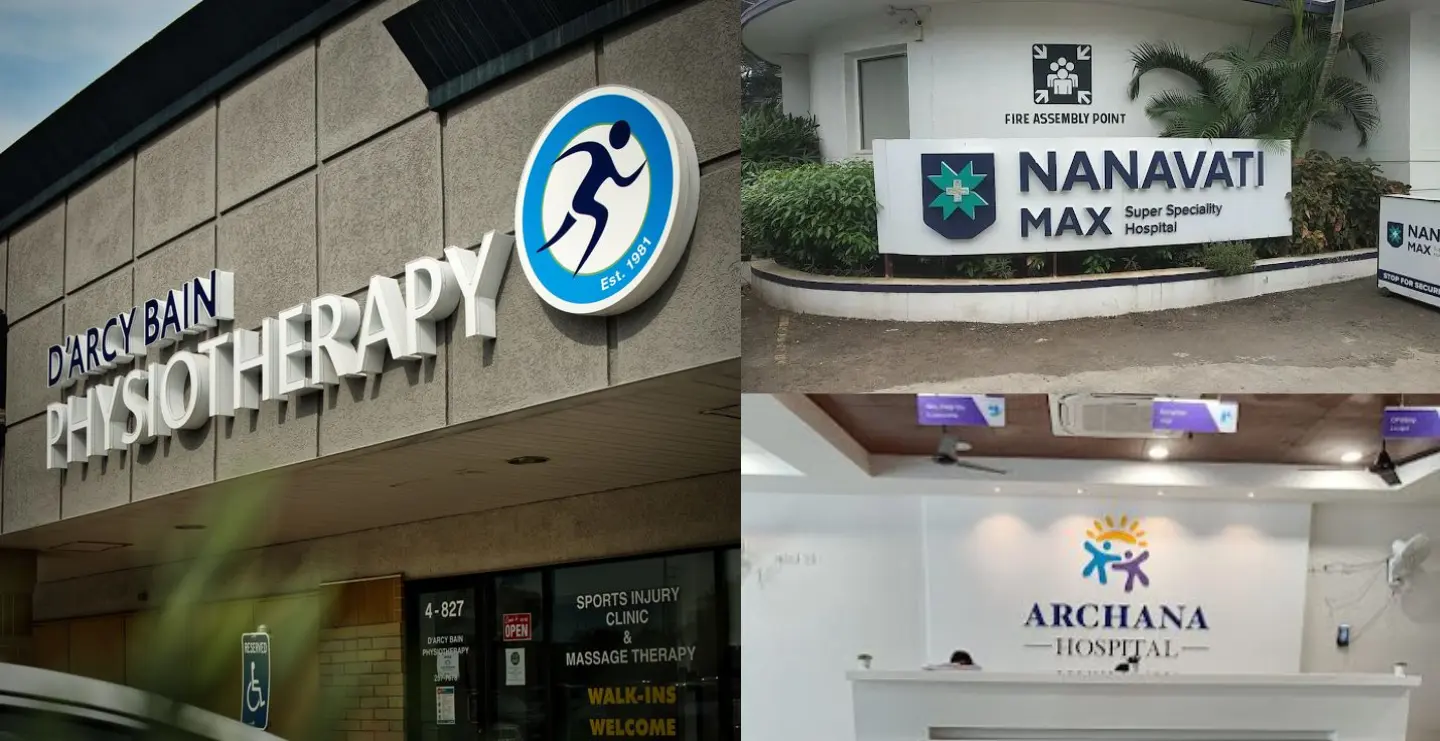
Walk into any corporate office whether it’s a tech startup, a global consulting firm, or a government building and before you meet anyone, before you speak to the receptionist, before the first handshake, you meet the office name board design. It is the silent greeter, the first impression-maker, the visual handshake of the brand.
Most businesses underestimate this small detail. But in the corporate world, presentation isn’t decoration, it's a strategic asset. And the corporate office name board holds more weight than anything else in shaping that first moment of trust, identity, and authority.
Why the Corporate Office Name Board Matters More Than It Looks
If you observe the top-performing corporate spaces Fortune 500 offices, finance institutions, global tech parks there’s one thing in common:
Their entrance name boards never look accidental. They look intentional.
A great corporate name board does something subtle yet extremely powerful. It communicates what kind of company you are without a single word being spoken.
Visitors subconsciously evaluate:
- How organized the company is
- How modern or traditional the brand feels
- Whether the business is premium or average
- How seriously the company takes its identity
- The internal discipline of the workspace
This is why companies spend significantly on design materials like brushed steel, frosted glass, and LED backlighting.
Because your corporate office name board is the brand’s first performance.
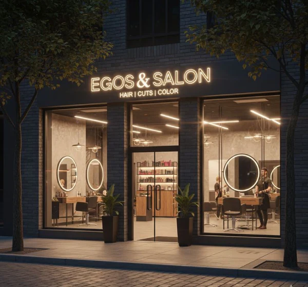
Trending Corporate Office name Board Designs for 2026


A Human Moment: The Psychology Behind First Impressions
Picture a visitor arriving early for a meeting. They walk up to the building, scanning for clues- Is this the right office? How professional is this company? What should I expect inside?
Before they meet a single employee, the name board becomes their first anchor.
If it’s outdated, dull, rusted, or confusing…
their mind fills in the blanks- “This office might be mismanaged.”
If it’s modern, clean, backlit, elegant, and well-placed…
they instantly assume- “This company is sharp and trustworthy.”
This is the psychology behind corporate name boards:
We judge what we see before we trust what we hear.
Where Corporate Name Boards Should Be Installed- And Why It Matters
Every installation point serves a different purpose. Choosing the right spot is as important as choosing the right material.
1. Main Building Entrance
This is the identity landmark.
It must be visible from a distance and withstand weather.
2. Reception Area
The most important indoor spot.
The board here sets the tone for every visitor, interviewee, supplier, and employee.
3. Lobby / Waiting Zone
Adds authority and reduces confusion about navigation.
4. Conference Room Entrance
Subtle but impactful for client meetings and presentations.
5. Department Boards & Floor Directories
Helps internal navigation while reinforcing brand consistency.
6. Outdoor Gate or Compound Wall
Needed for large campuses or corporate buildings with multiple offices.
In modern corporate design, clarity is a form of respect.
Signage that guides people seamlessly shows operational excellence.
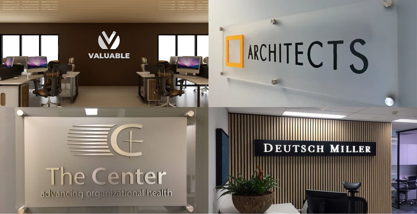
Popular Materials Used in Corporate Office Name Boards
A material isn’t just a material; it’s a tone of voice.
Here’s what each one communicates:
1. Acrylic Name Boards
Tone: Modern, minimal, smart
Widely used in offices that want clean, sharp branding.
Great for reception and indoor branding.
Why experts love it:
- Lightweight
- Customizable
- Supports 3D letters
- Works well with LED lighting
2. Stainless Steel or Brushed Metal Name Boards
Tone: Strong, premium, corporate authority
Used heavily by finance companies, IT parks, industrial HQs, and legal firms.
Why it works:
- Long lifespan
- High-impact finish
- Conveys solidity and seriousness
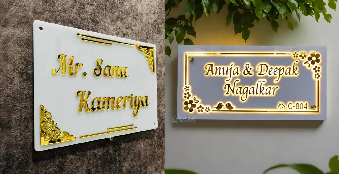
3. Brass / Gold Finish Boards
Tone: Luxury, heritage, premium positioning
Seen in multinational firms, luxury brands, and consultancy firms.
Why brands choose it:
- Feels expensive
- High perceived value
- Makes the office look influential
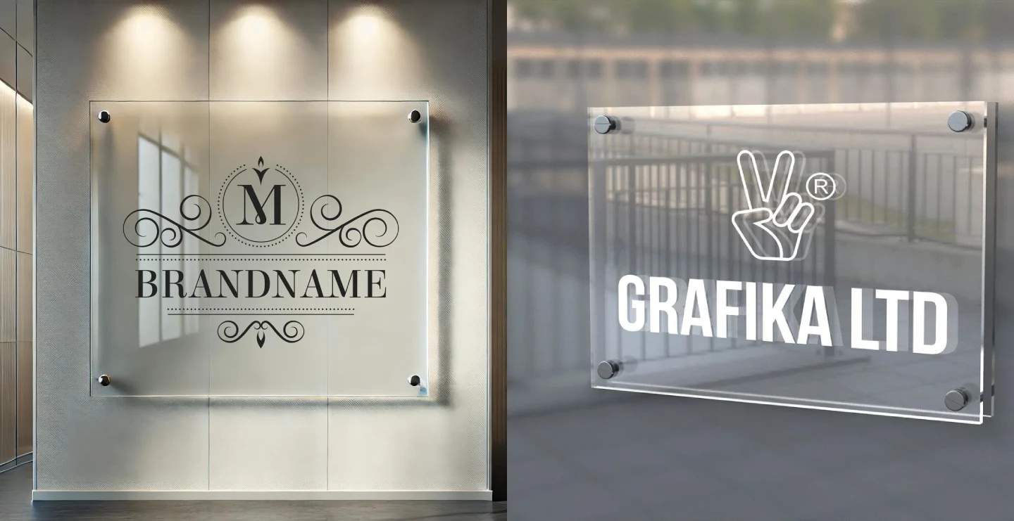
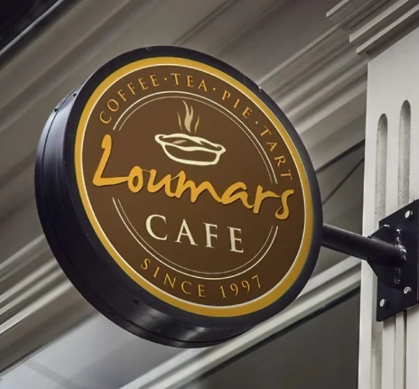
4. Glass or Frosted Glass Name Boards
Tone: Elegant, minimal, sophisticated
Perfect for corporate boardrooms, lobbies, and reception zones.
Why designers prefer it:
- Clean aesthetic
- High readability
- Pairs well with metal stand-offs
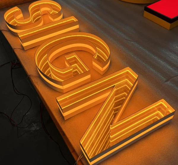
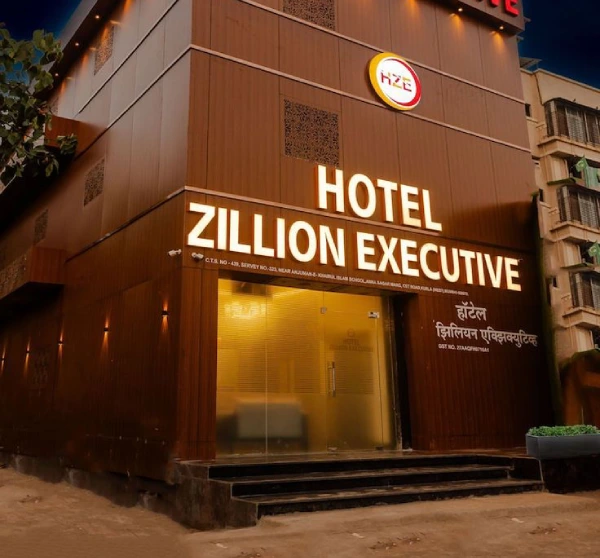
5. LED & Backlit Name Boards
Tone: Modern, premium, futuristic
One of the most popular choices for entrances.
Why CEOs choose it:
- Night and day visibility
- Strong brand recall
- Creates a premium first impression
6. ACP (Aluminum Composite Panel) Name Boards
Tone: Durable, practical, outdoor-friendly
Best for building exteriors, industrial parks, and large campuses.
Why facility managers love it:
- Weather-resistant
- Cost-effective
- Sturdy for outdoor use
Design Principles Every Corporate Office Name Board Must Follow
Great design is not about doing more, it’s about doing the right things.
Here are expert-backed principles used by top signage designers:
1. Choose the Right Font (Most Important Decision)
Fonts silently communicate personality.
Corporate favorites include:
- Gotham
- Montserrat
- Helvetica Neue
- Futura
- Proxima Nova
- Roboto
- Lato
These fonts are clean, modern, easily readable, and professional and mostly used in name board designs. Never use cursive or heavy decorative fonts for corporate boards, they might look stylish but fail at legibility.
2. Use a Smart Color Palette
Top corporate combinations:
- Black + Silver
- White + Navy
- Matte Black + Warm White LED
- Grey + Gold
- Frosted Glass + Black Letters
Good signage focuses on high contrast + minimalist tones to maintain premium visual clarity.
3. Prioritize Finish & Texture
Textures change perception instantly.
Trending choices:
- Brushed metal (modern corporate look)
- Matte finish (minimal, premium)
- Mirror steel (luxury, bold)
- Frosted texture (soft and elegant)
These textures influence how visitors emotionally respond to your brand.
What Information Should a Corporate Office Name Board Display?
The best signboards balance simplicity with clarity.
Depending on placement, they may include:
Entrance & Reception Boards
- Company name
- Logo
- Tagline
- Head office label
Department & Internal Boards
- Department name
- Floor number
- Room or cabin label
Outdoor / Compliance-Based Boards
- Registration number
- Office hours
- Contact information
Rule:
If your signage makes people stop and read twice, it’s too cluttered.
Corporate Office Name Board Design Types
1. Minimalist Design
- Clean typography.
- High whitespace.
- Neutral colors.
Used by modern tech companies and startups.
2. Backlit Premium Design
- Soft halo glows behind letters.
- Great for high-end corporations or towers.
3. 3D Floating Letter Design
- Individual raised letters installed directly on the wall.
- Looks sculpted and architectural.
4. Architectural Texture Design
- Mixes cement textures, wood panels, glass layers, or metal grids.
- Makes the office look designer-built.
5. Mono-Material Boards
- Uses only one material (like full-steel or full-acrylic).
- Creates a unified, premium aesthetic.
Real Benefits of a Well-Designed Corporate Office Name Board
Not surface-level benefits, real business-level impact:
Enhances workplace credibility
When everything looks intentional, people assume the company is well-managed.
Improves how clients perceive your brand
A premium name board adds silent authority to every meeting.
Helps employees feel they belong
A thoughtfully designed corporate environment increases workplace pride.
Reduces confusion & improves navigation
Clear signage = smoother operations.
Boosts brand consistency
Every department, floor, and entrance feels unified.
Long-term identity investment
Unlike décor, a good name board lasts years.
Maintenance Tips
- Clean with non-abrasive solutions
- Avoid rough cloths or metal brushes
- Check LED wiring every few months
- Re-polish metal boards annually
- Replace boards during rebranding
- Ensure outdoor signage is weather-protected
Well-maintained signage sends a message: This company cares about quality, even in the details.
Who Needs Corporate Office Name Boards?
Essential for:
- IT & Software companies
- Finance & banking institutions
- Consulting firms
- Real estate & construction firms
- Industrial HQs
- Startups
- Co-working spaces
- Government offices
- Global corporate branches
Any organization with a workspace benefits from clear, premium signage.
Conclusion: Office Name Board Is Your Brand’s First Statement
In a world where attention spans are shrinking and first impressions form in seconds, a office name board becomes the face of your brand.
It’s not just about showing your name.
It’s about showing who you are.
Premium or minimal, backlit or brushed metal, choose a design that reflects your culture, your values, and your identity.
Because long before you speak a word, your name board speaks for you.