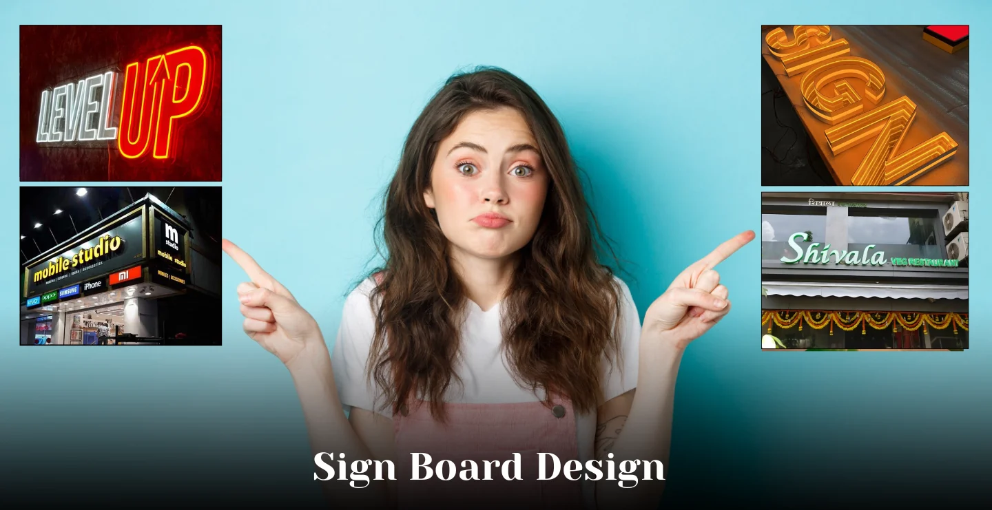
Walk past any busy street and you'll notice something interesting: signs are no longer just labels. They’re storytellers, navigators, and increasingly quiet technology hubs. Over the last few years I’ve watched store name boards, office name boards, and other signages shift from “put up a sign” to “create an experience.” Below are the trends that matter right now, the real reasons behind them, and practical ways to use each trend for your business.
1) Digital is The Backbone but Content Wins The Day
The hardware revolution brighter screens, thinner displays, cloud control has made digital signage affordable and scalable. But the real difference comes from content that’s short, local, and useful. A coffee shop that shows today’s roast, a clinic that rotates doctor names and wait times, or a retail store that switches promotions at rush hour are the setups that actually move people.

Why this works: digital signage lets you change messages instantly and respond to events (stock, weather, footfall). Brand teams who use simple rules, rotate high-margin promos in slow hours, highlight social proof during rush get better results than those who treat digital screens like static posters. For state-of-the-art digital signage platforms, expect cloud-based management and integration with data sources (inventory, CMS, IoT) to become the norm.
How to try it: start with one screen at your entrance. Rotate two messages only the main product and a limited-time offer. Measure a simple KPI (redemption, QR scans) for 30 days and iterate.
2) Sustainability Isn’t Optional- It’s a Selling Point
People notice materials now the way they notice fonts. Recycled acrylic, low-energy LEDs, and biodegradable temporary signs are becoming decision factors, not just cost options. Retailers and corporate tenants increasingly ask for evidence that signage choices minimize waste and energy draw.
Why it matters: choosing sustainable materials reduces lifecycle costs and signals responsible branding. Even small moves swapping fluorescent tubes for LED retrofit kits or choosing FSC-certified wood for interior plaques add up. Designers are also favoring modular systems that can be reconfigured instead of remade.
How to try it: ask your supplier for an “eco kit” option, LED retrofit plus recycled substrate. Put a tiny “made with recycled materials” badge on the sign or nearby window; customers notice those signals.
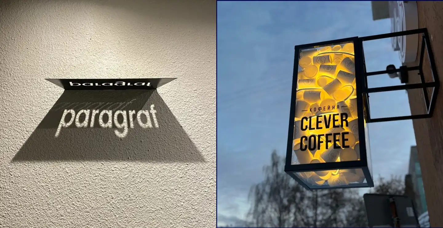
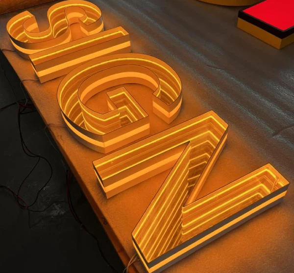
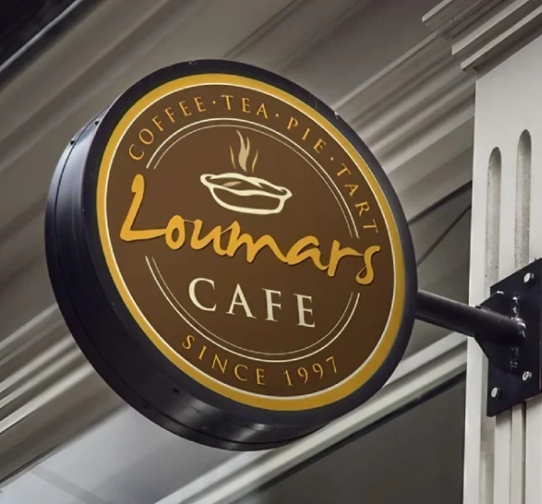
3) Neon and Handcrafted Aesthetics Make a Comeback with LED Smarts
There’s been a clear revival of neon-style and handmade looks, but with modern tech. LED “neon” tubes and edge-lit acrylic give the warm, handmade glow people love, while staying weather-resistant and energy-efficient. These signs are popular for hospitality, co-working spaces, and boutique retail that want character, not corporate sterility.

Why this works: handcrafted visuals cut through the digital noise. When everything is polished and chrome, something warm and slightly imperfect feels human and people remember it. Use this style to create a personality-driven façade or an Instagrammable moment inside a store.
How to try it: pick a small, high-visibility spot (reception wall, window alcove) and try a neon-style sign with your logo or a short phrase. Ask for dimmable LEDs so you can tune the mood for day and night.
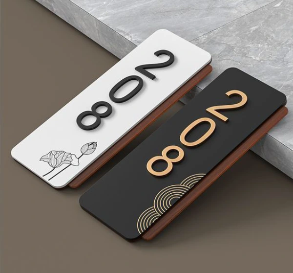
4) Wayfinding and Micro-signage: Tiny Signs, Huge Impact
Large brand signs attract attention; small wayfinding signs improve the customer journey. Thoughtful micro-signage door plates, directional arrows, floor graphics reduces friction and improves perceived professionalism. Offices that standardize name boards, meeting-room displays, and directory boards report fewer front-desk interruptions and smoother meetings.

Why this matters: every minute a visitor spends asking “Where is HR?” costs you in perceived inefficiency. Good wayfinding saves time and makes an office look polished. Combine material continuity (same finish across large and small signs) for stronger brand cohesion.
How to try it: audit your workspace for 5 “confusing” spots (entrance, restrooms, pantry, meeting rooms, reception). Replace or add signs that answer the question before someone needs to ask.
5) Personalization and Local Relevance Beat Generic Messaging
People respond when a sign speaks to them, not just to a broad audience. Retailers who tailor messages by location (city events, local weather, neighborhood slang) see higher engagement. For offices, localized sign content (visitor name boards, meeting agenda displays) increases professionalism and reduces friction.
Why it works: personalized, local content feels like a conversation. With digital systems and simple integrations (calendar, CRM), personalization is cheaper and faster than ever. Even small personalization, adding the visitor’s company name on a lobby screen, creates an outsized positive impression.
How to try it: integrate your reception display with meeting calendar software to show upcoming meetings and host names on arrival.
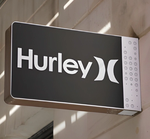
6) Typography and Minimalism: Clarity Wins
Design trends have swung back to clear typography: big, legible type, higher contrast, and minimal clutter. That’s true for front-of-house storefronts and interior name plates alike. The “less but clearer” principle helps signs work in more lighting conditions and from various sight distances.
Why it matters: signs exist to be read quickly. Heavy ornamentation or tiny type defeats the purpose. A good sign prioritizes legibility first, personality second.
How to try it: choose two typefaces max, one for the headline (brand name) and one for supporting copy. Test visibility at a distance: take a photo from 10–15 meters and ask if the text remains readable.
7) Integration with Mobile and AR- Subtle but Growing
A few brands are quietly pairing signs with mobile actions: scan a code to get a coupon, tap an NFC tag to check in, or point a phone at a mural for AR layers. These integrations convert passive viewing into measurable engagement and give signage a direct ROI.
Why it’s creeping up: smartphones lower the barrier for interaction. When signs are part of a measurable loop (scan > redeem), they stop being purely decorative and become sales tools.
How to try it: add a QR code to a poster campaign with a simple offer. Track scans and sign up for a basic analytics report from your digital signage platform.
8) Durability and Modularity for a Tighter Budget
Suppliers are offering modular sign systems that reuse frames and swap panels. That reduces replacement cost and helps brands update messaging quickly without a full rebuild. For large-format signs (mall directories, campus boards), modularity can save sizable budgets.
Why it matters: modularity aligns with sustainability and budgeting needs. Instead of replacing an entire channel letter setup, swap the face plate or the LED module. The result: fresher content with lower lifetime costs.
How to try it: request a modular quote, compare lifetime costs (capex + maintenance) for fixed vs modular systems over a 5-year horizon.
9) The Human Element: Story-rich Signage
Signs that tell a story, a founder's line, a date, a short mission phrase, create emotional attachment faster than purely transactional messages. Hospitality brands use little narrative cues in lobbies; professional offices include founder photos and years of operation in reception. Those elements build trust fast.

Why it works: people are wired for narrative. A short, relevant human detail on a sign converts neutral curiosity into a connection.
How to try it: add one line of micro-copy on your reception board: “Serving this neighborhood since 2009,” or “Founded by [Name].” Keep it short, truthful, and memorable.
Final note- Pick the Right Combination for Your Context
There’s no single “best” sign tactic. The winning approach blends durability, clarity, and relevance. For many businesses, a hybrid strategy, a strong physical sign at the curb, digital displays at touchpoints, and small wayfinding and narrative cues inside, creates the best customer flow and brand impression.
If you’re planning an update this year, start with three decisions:
(1) what problem the sign should solve (visibility, navigation, promotion)
(2) where the sign will sit (indoor/outdoor/entry/reception)
(3) what story it should tell.
From there, choose materials and platforms that support your budget and sustainability goals.